Brand
Guidelines
The single source of truth for what we do and how we look and sound: our services, colours, type, logo, icons and tone, across the website, landing pages, adverts, brochures, presentations, reports and apps.
Core rules
Most brand mistakes come from a handful of rules. Get these right and anything you make reads as iceConnect.

Do
- Let slate and neutrals carry the design, with brass as the single accent
- Pair Bricolage Grotesque headings with DM Sans body text
- Keep generous whitespace and a consistent left edge
- Use the supplied logo files and Lucide line icons
- Keep green, amber and red for status, always with words
- Write in plain English for a busy owner, not an IT person
Don't
- Introduce off-brand colours or a second accent
- Set body copy in the heading font
- Crowd elements or centre body text
- Put the logo on brass, steel or any colour
- Mix icon styles, use filled icons or emoji
- Use status colours as decoration
Brand colours
The full palette with screen (HEX and RGB) and print (CMYK and Pantone) values together. The core palette is the brand: slate and warm neutrals carry the weight and brass is the single accent. Functional colours each do one job and sit outside the brand proportions.
Core palette
RGB 15, 23, 42
CMYK 64, 45, 0, 84
Pantone 5255 C
RGB 200, 163, 91
CMYK 0, 18, 55, 22
Pantone 4006 C
RGB 242, 235, 217
CMYK 0, 3, 10, 5
RGB 250, 248, 244
CMYK 0, 1, 2, 2
RGB 243, 241, 236
CMYK 0, 1, 3, 5
RGB 230, 226, 218
CMYK 0, 2, 5, 10
RGB 212, 206, 196
CMYK 0, 3, 8, 17
RGB 107, 104, 98
CMYK 0, 3, 8, 58
Functional colours · one job each
RGB 22, 163, 74
CMYK 86, 0, 55, 36
RGB 217, 119, 6
CMYK 0, 45, 97, 15
RGB 220, 38, 38
CMYK 0, 83, 83, 14
RGB 78, 124, 161
CMYK 52, 23, 0, 37
Pantone 5415 C
Colour usage
Slate leads. Whether a piece is dark or light, brass stays at about a tenth of the design, and a little goes a long way.
Proportion · dark-led
Covers, heroes, slide dividers, social posts, footers and anything that should feel like iceConnect at a glance.
60% slate · 30% neutrals · 10% brass
Proportion · light-led
Documents, reports, web pages and apps, where people read for longer.
60% neutrals · 30% slate · 10% brass
Neutrals are the warm off-white, white and warm tint: they soften the navy and sit comfortably with brass. Steel sits outside both proportions: it belongs in charts and information graphics. Status colours sit outside them too.
Approved pairings
Typography
Two free Google Fonts with clear jobs. Install the static weights on every machine that makes assets: Bricolage Grotesque 700 and 800, and DM Sans 400, 500, 600 and 700.
Type scale
One scale for screen, slides and documents. Headings sit tight (1.0–1.1); body text is 1.5 on screen and 1.25–1.3 in print. Left-align everything except covers and section titles. Cover is used once per piece, on covers only; it is the one size that scales with the screen.
Print 54–60pt
Guidelines
Print 40pt
Print 26pt
Print 16pt
Print 11.5pt
Print 10.5–11pt
Print 9pt
Print 8pt
Print 8pt
Logo usage
The four-colour "C" mark with the lowercase wordmark: grey on light grounds, white on dark. Place it only on slate, off-white or white. Every size and format is in Logo downloads.
Approved backgrounds
 On slateOn off-whiteOn white
Clear space & minimum size
Clear space
Keep clear space around the logo equal to the height of the "i" in iceconnect, on all sides. Never let text, edges or other logos encroach.
Minimum size
Never smaller than 120px wide on screen or 25mm wide in print. Below that, use the icon-only mark. At favicon sizes (16–32px) use the dedicated favicon files.
Logo don'ts
Logo downloads
Every approved logo file, grouped by variant. SVG is the primary format for web and apps; PNG is the fallback where SVG isn't supported, such as email and Office; PDF and EPS are for print. Each preview sits on the ground the file is made for. Click a format to download it.
Full logo · mark and wordmark


Icon only · the “C” mark


Favicon & app icons































Serve SVG on web pages. The large PNGs are for print, app stores and asset libraries, not for the website.
Iconography
One consistent line style across everything. Icons clarify; they never decorate. Below is the standard set we use across the brand, in its Lucide line form.
Source · Lucide
lucide.dev
Download all icons from lucide.dev. It is a clean, even-stroke line set, free for commercial use (ISC licence, no attribution), and its restrained style suits our look. Lucide draws at a 2px stroke by default, so set it to 1.75. Use Lucide only and never mix icon sets. The names under each icon below are the exact search terms on lucide.dev.
Our standard icon set
Style rules
Do
Line style only, at a consistent 1.75 stroke. Slate by default. Brass only to highlight one key icon per layout. Match the icon weight to the text beside it.
Don't
No filled icons, no mixing line and fill, no multi-colour icons, and no emoji. Steel and status colours only for data and status. Don't scale icons so their strokes look heavier or lighter than the set.
Photography
Imagery should feel premium, calm, real and considered, never stocky or busy. The six reference samples below show the look we buy and shoot to.
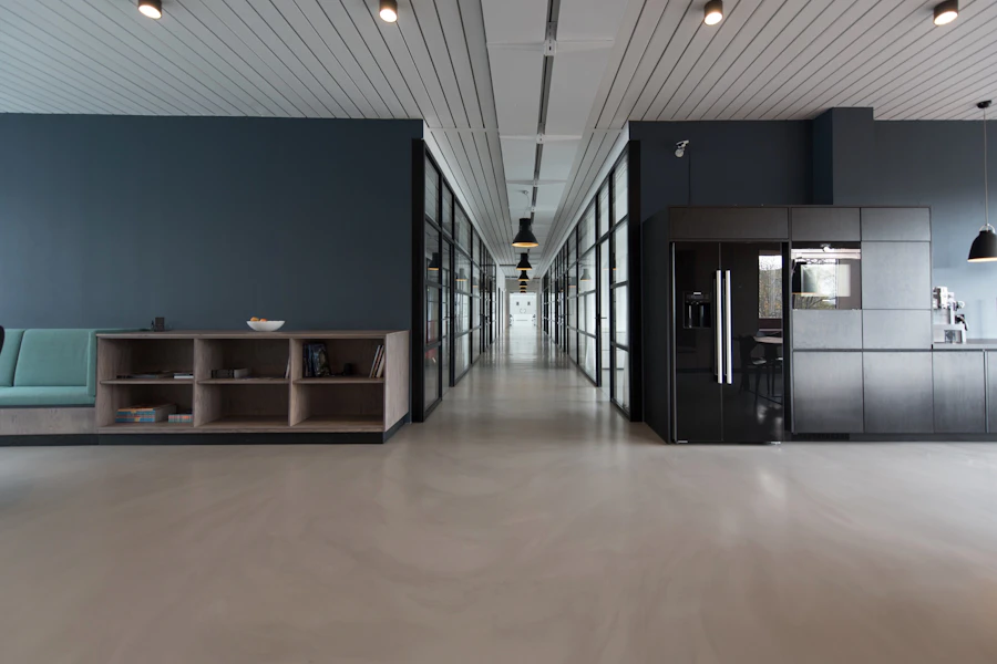
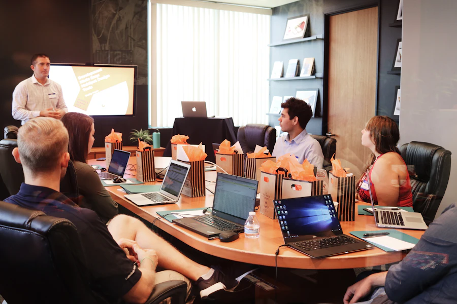
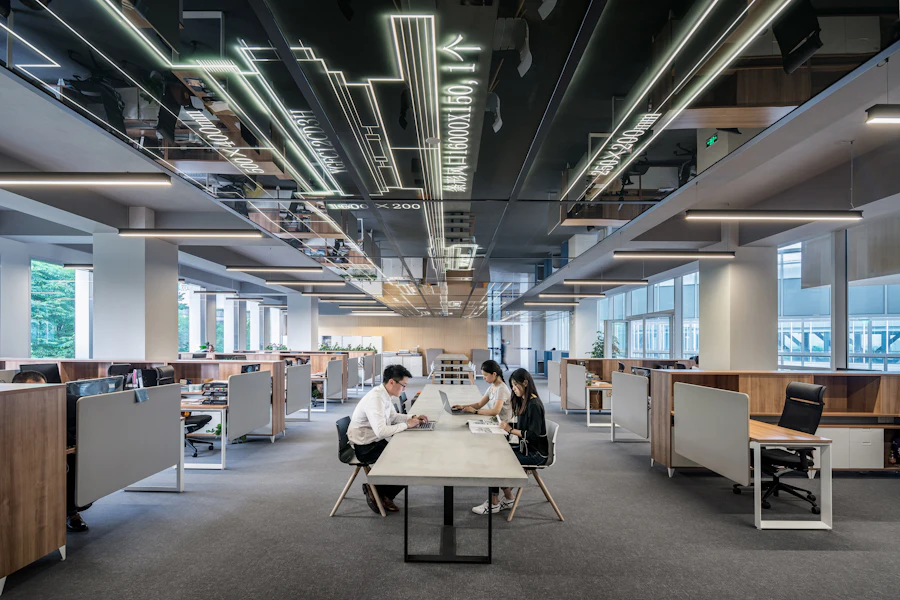


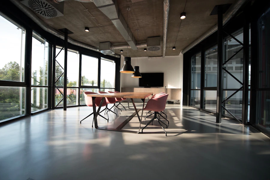
Art direction
Aim for
Real people and real UK workspaces over generic stock. Natural light, shallow depth of field, clean uncluttered compositions with breathing room. Natural light with a slightly warm, soft grade that sits with slate and brass. Where a brand tone is needed, a subtle slate overlay or brass highlight, applied lightly.
Avoid
Cheesy handshake/headset stock, harsh saturated colour, cluttered server-room clichés, heavy filters, busy backgrounds behind a logo, and any image that looks staged or low-resolution.
AI-generated images
When it's allowed
Abstract backgrounds, textures and illustrations. Check the tool's licence allows commercial use.
Never
People, our team or clients, or anything presented as a real event, office or result.
Minimal, calm, premium abstract background. Deep slate navy (#0F172A) with soft natural light and subtle brass (#C8A35B) highlights, cool and slightly desaturated. Clean and uncluttered with lots of negative space. No text, no people, no logos.
Tone of voice
Our audience runs businesses; they are not IT specialists. Write in plain English, sound confident and reassuring, and never show off with jargon.
We sound like this
- Plain English a busy owner understands at a glance
- Confident and reassuring: we've got this handled
- Clear about the benefit, not the technology
- Warm and human, like a trusted advisor
- Specific and honest over vague or salesy
We never sound like this
- Stuffed with acronyms and technical terminology
- Boastful, hyped or full of superlatives
- Cold, corporate or robotic
- Patronising or assuming prior IT knowledge
- Vague: "solutions", "synergy", "best-in-class"
Word list · use and lose
| Use | Lose |
|---|---|
| keep your systems running | maximise uptime / high availability |
| protect your business | endpoint threat mitigation |
| back up your data | immutable backup architecture |
| we'll set it up for you | seamless deployment & onboarding |
| help when you need it | 24/7 SLA-backed support tiers |
| a second check when you sign in | MFA, conditional access policies |
| we watch for attacks day and night | 24/7 SOC with SIEM correlation |
| move you to the cloud | cloud transformation journey |
| a fixed monthly cost | OpEx-aligned consumption model |
| we'll fix it | we'll remediate the issue |
Before & after
Our proactive RMM platform leverages enterprise-grade SIEM and EDR to deliver best-in-class threat remediation across your entire estate.
We watch over your computers around the clock and stop most problems before you'd ever notice them, so your team can just get on with work.
Writing style
House rules for spelling, dates, numbers and punctuation, so every document reads as if one person wrote it.
| Topic | Rule | Example |
|---|---|---|
| Our name | One word, lowercase i, capital C, even at the start of a sentence. | iceConnect, never ICEconnect, Ice Connect or IceConnect |
| Spelling | UK English. | organise, colour, licence (noun), programme |
| Headings | Sentence case. Service names keep their capitals. | How we protect your data · Cyber Security |
| Dates | ISO 8601 everywhere: year, month, day. | 2026-09-27 · 2026-09 |
| Times | ISO 8601, 24-hour clock. Date and time together with a space. | 09:00 · 2026-09-27 14:30 · 09:00–17:30 |
| Numbers | One to nine in words, 10 and above in numerals. Always numerals for money, statistics and percentages. | three offices · 20 years · 40% |
| Money | Pound sign, no pence unless they matter, units spelled out. | £45 per user per month |
| Punctuation | No em dashes: use a full stop, comma or colon. No exclamation marks in client copy. Use "and" in sentences; keep & for names and tight labels. | We set it up. You get on with work. |
| Acronyms | Avoid them. If you must use one, explain it in plain words the first time. | multi-factor authentication (a second check when you sign in) |
| Calls to action | One per piece. Verb first, with a specific outcome. | Book a 20-minute IT health check, never "Learn more" |
| Phone | Spaced UK format. | 020 3358 0000 |
| File names | Client, document and ISO date, with no spaces. | ClientName-IT-Review-2026-09-27.pdf |
Messaging
Approved words about who we are, ready to use. Start from these rather than writing a new "about us" each time.
Positioning
iceConnect keeps UK businesses running, secure and ready for what's next. We look after the technology so owners and managers can get on with running the business.
Boilerplate
Short
iceConnect is a UK managed IT provider. For 20 years we have kept businesses running and secure, from everyday IT support to cyber security, cloud and AI.
Medium
iceConnect is a UK managed IT provider with offices in London, Chelmsford and Johannesburg. For 20 years we have looked after the technology behind growing businesses, so their people can get on with work. We cover IT support, cyber security, compliance, Microsoft 365, cloud, networks, communications, backup, AI and IT strategy, all from one team.
Long
iceConnect is a UK managed IT provider with offices in London, Chelmsford and Johannesburg. For 20 years we have looked after the technology behind businesses of 30 to 200 people, with particular depth in financial services, dental, manufacturing and logistics. Our clients get a UK service desk that picks up, security that watches around the clock, and a named team that knows their business. We cover 10 areas, from everyday IT support and cyber security to cloud, communications, backup and AI, so there is one partner to call and one monthly cost to plan around. We explain things in plain English and measure ourselves on one thing: whether your business keeps running.
Who we write for
Owners and managers of UK businesses, mostly with 30 to 200 staff, in financial services, dental, manufacturing and logistics. They are experts in their own business, not in IT. They want it to work, stay secure and cost what they planned.
Brand family
Client Portal
Uses Slate & Brass in full, including the menu this page is built on.
CallScore AI
Has its own visual identity and carries "Built by iceConnect".
The Cyber CEO
A separate brand with its own guidelines. Never uses Slate & Brass.
What we do
10 areas of expertise. Everything we deliver sits under one of them, and every piece of marketing should speak to at least one. Use the names exactly as written, with the icon shown.
IT Support
A UK service desk, proactive monitoring and well-managed devices, so problems are fixed before they slow anyone down.
- Service Desk & Remote Support
- Onsite Support
- User Onboarding & Offboarding
- Device Setup & Deployment
- Hardware Procurement & Warranty
- IT Asset Management & Documentation
- Proactive Monitoring (RMM)
- Patch Management
- Vendor Management
Cyber Security
Layered defences, 24/7 detection and response, and a security-aware workforce.
- Endpoint Protection (EDR/XDR)
- Managed Detection & Response (MDR)
- Security Operations Centre (SOC)
- Email Security & Anti-Phishing
- DNS Security & Web Filtering
- MFA & Conditional Access
- Identity & Privileged Access
- Security Awareness Training
- Dark Web Monitoring
Governance, Risk & Compliance
Assessments, testing and certifications that make compliance manageable.
- Vulnerability Management
- Penetration Testing
- Data Loss Prevention (DLP)
- Cyber Essentials & Plus
- GDPR & Data Protection
- Data Governance & Retention
- Risk Assessments
- Technology Audits
- Policy & Compliance Support
Microsoft 365 & Productivity
Microsoft 365 set up, secured, licensed and supported end to end.
- 365 Licensing & Optimisation
- Tenant Management
- Exchange Online
- Microsoft Teams
- SharePoint & OneDrive
- Email Migration
- Collaboration Platforms
- Productivity Training
Cloud & Infrastructure
Cloud, servers and storage designed, migrated, monitored and managed.
- Microsoft Azure & AWS
- Private & Hybrid Cloud
- Hosting & Co-Location
- Virtual Servers & Virtualisation
- Server & Storage Management
- Infrastructure Design
- Infrastructure Monitoring
- Cloud Migration
- Capacity Planning
Network & On-Premise Infrastructure
Networks, Wi-Fi and firewalls that are designed, monitored and just work.
- Switching & LAN/WAN
- Wi-Fi & Guest Networks
- Managed Routers & Firewalls
- Structured Cabling
- Network Design
- Network Monitoring
- Site Surveys
Communications & Connectivity
Internet, telephony and contact-centre tools from one supplier.
- Business Internet & Leased Lines
- SD-WAN
- VoIP & Hosted Telephony (SIP)
- Microsoft Teams Calling
- Contact Centre
- Call Recording & Reporting
- Auto Attendants & Call Routing
- Business Mobiles & Integration
- Continuity Telephony
Backup & Business Continuity
Backup, disaster recovery and continuity planning, monitored and tested.
- Microsoft 365 Backup
- Server & Endpoint Backup
- Cloud Backup
- Disaster Recovery
- Business Continuity Planning
- Recovery Testing
- Backup Monitoring & Compliance
- Ransomware Recovery
- High Availability
AI & Automation
Copilot, automation and AI adopted safely and governed properly.
- Microsoft Copilot & Adoption
- AI Readiness Assessments
- AI Governance & Security
- Business Process Automation
- Workflow Automation (Power Automate)
- AI Chatbots
- Knowledge Management
- Custom AI Solutions
Strategy & Projects
vCIO strategy, roadmaps and projects delivered without drama.
- vCIO & CIO Services
- IT Roadmaps & Strategic Reviews
- Technology & Budget Planning
- Digital Transformation
- Project Delivery & Migrations
- Office Moves
- Mergers & Acquisitions Support
- Due Diligence
Components & navigation
The building blocks that repeat across web, decks and documents. Buttons, fields and their full interaction states live in Component states.
Cards
Card title
White fill, 1px border (#E6E2DA), soft shadow and generous inner padding. The core content container.
Reports & dashboards
| Site | Devices | Patched | Status |
|---|---|---|---|
| London | 142 | 100% | Healthy |
| Chelmsford | 58 | 96% | 3 pending |
| Remote staff | 37 | 92% | 3 pending |
Example figures. One key figure per row gets the brass underline. Tables use a slate header, with numbers right-aligned in tabular figures.
Navigation
The current location is always marked with a brass indicator and slate weight; everything else stays muted until hovered or active. One primary action per bar, and icons always carry a text label, never icon-only. Keep the bar left-aligned: logo and links on the left, the single brass button on the right.
Design tokens
Brand values, expressed as tokens an app can consume. Primitives are the raw palette; semantic tokens give each value a role, and the role is what stays consistent across every app, platform and theme.
Why two layers
Primitive
The raw value: slate #0F172A, brass #C8A35B. Named for what it is. Rarely referenced directly in product code.
Semantic
The role: text.primary, action.primary. Named for what it does. Components reference these, so dark mode or a re-theme is a token swap, not a find-and-replace.
Neutral ramp
Light surfaces and their text use the warm neutrals. The slate greys serve dark mode.
Semantic tokens · light theme
| Token | Value | Use |
|---|---|---|
| text.primary | #0F172A | Body copy, headings |
| text.secondary | #6B6862 | Supporting text on every light ground |
| text.on-tint | #4E4B46 | Stronger supporting text on tinted fills |
| text.inverse | #FFFFFF | Text on the opposite ground |
| text.on-accent | #0F172A | Label on brass fills |
| bg.page | #FAF8F4 | App background |
| bg.surface | #FFFFFF | Cards, sheets, inputs |
| bg.muted | #F3F1EC | Subtle fills, hovers |
| bg.inverse | #0F172A | Inverted panels |
| border.default | #E6E2DA | Hairlines, dividers |
| border.strong | #D4CEC4 | Emphasised dividers |
| action.primary | #C8A35B | Primary buttons, key CTAs |
| action.primary-hover | #BC9550 | Primary button hover |
| action.primary-text | #0F172A | Label on primary |
| action.secondary | #456E8E | Secondary buttons, links |
| action.secondary-hover | #3B5F7D | Secondary button hover |
| action.secondary-text | #FFFFFF | Label on secondary |
| focus.ring | #6B6862 | Focus outlines on light grounds |
| status.success | #16A34A | Success / positive |
| status.warning | #D97706 | Warning / caution |
| status.error | #DC2626 | Error / destructive |
| status.info | #4E7CA1 | Informational |
Semantic tokens · dark theme
| Token | Value | Use |
|---|---|---|
| text.primary | #F1F5F9 | Body copy, headings |
| text.secondary | #94A3B8 | Supporting / muted text |
| text.inverse | #0F172A | Text on the opposite ground |
| text.on-accent | #0F172A | Label on brass fills |
| bg.page | #0F172A | App background |
| bg.surface | #1E293B | Cards, sheets, inputs |
| bg.muted | #334155 | Subtle fills, hovers |
| bg.inverse | #FAF8F4 | Inverted panels |
| border.default | #334155 | Hairlines, dividers |
| border.strong | #475569 | Emphasised dividers |
| action.primary | #C8A35B | Primary buttons, key CTAs |
| action.primary-hover | #D4B373 | Primary button hover |
| action.primary-text | #0F172A | Label on primary |
| action.secondary | #456E8E | Secondary buttons, links |
| action.secondary-hover | #3B5F7D | Secondary button hover |
| action.secondary-text | #FFFFFF | Label on secondary |
| focus.ring | #C8A35B | Focus outlines on dark grounds |
| status.success | #16A34A | Success / positive |
| status.warning | #D97706 | Warning / caution |
| status.error | #DC2626 | Error / destructive |
| status.info | #4E7CA1 | Informational |
Status tokens
Each status is a set, not one colour: a tint for the background, the base for icons and fills, and a darker shade for text that clears WCAG AA. The base hues are for icons and fills only; use the text token for any words.
| Status | Background | Base · icon/fill | Text · AA |
|---|---|---|---|
| success | #DCFCE7 | #16A34A | #15803D · 5.0:1 |
| warning | #FEF3C7 | #D97706 | #B45309 · 5.0:1 |
| error | #FEE2E2 | #DC2626 | #B91C1C · 6.5:1 |
| info | #E8EFF5 | #4E7CA1 | #3B5F7D · 6.7:1 |
Status pills
A compact way to show a single state inline: a pulsing status dot beside a short label. The same tokens stay legible on light and dark surfaces, so use the set that matches the background.
action.primary, never #C8A35B. That is what lets the same code render correctly in light, dark and any future theme.Data visualisation
Dashboards, reports and monitoring are core to what we do, so charts get their own palette. Keep series muted to match the brand, use the categorical set in order, and apply these colours through your charting library’s theme.
Categorical · distinct series
Use in order, left to right: steel and brass, the brand pair, lead. Past six series, group the long tail into “Other” or rethink the chart.
Sequential · one measure, low → high
A single-hue steel ramp for heatmaps, intensity and utilisation. One hue keeps it readable.
Diverging · around a midpoint
For values over or under a target, such as response times or capacity headroom. Status red and green anchor the ends; neutral sits at the midpoint.
Examples in use
Hover or tap any chart to preview it on a dark surface. The series colours stay put while the gridlines, axes and background change. That is the rule for dark mode: re-theme the frame, keep the data.
Bar
Categorical: one colour per category, in palette order.
Line
Trends over time; steel and brass lead, then teal.
Stacked area
Composition over time: how the parts make the whole.
Donut
Share of a total. Keep to a handful of slices.
Grouped bar
Comparison: two series side by side (this period vs last).
Status bar
Status in a chart: healthy, warning, critical from the status tokens.
Applying the palette
// iceConnect data-viz palette
const iceChart  = ['#4E7CA1','#C8A35B','#4F9D8C','#8C6A93','#C0795B','#64748B'];
const iceStatus = { success:'#16A34A', warning:'#D97706', error:'#DC2626' };

// Chart.js
new Chart(ctx, { data:{ datasets:[{ backgroundColor: iceChart }] } });

// Apache ECharts
option = { color: iceChart };

// Recharts
<Cell fill={iceChart[i % iceChart.length]} />
Spacing, layout & motion
The scales that give every screen the same rhythm. Spacing is built on the 8px base, with 4px as the only half-step; breakpoints, layering and motion follow the same discipline.
Spacing
Radius
Elevation
Inputs, chips
Cards, popovers
Modals, sheets
border.default hairline instead of elevation.Layering · z-index
One z-index scale with seven named tiers, so overlapping surfaces never fight. Stay on the scale; never invent ad-hoc values like z-index: 9999. Each tier sits cleanly above the one before.
Breakpoints
Mobile-first: design for the narrowest screen, then layer enhancements up at each min-width. Four tiers carry every layout, with no horizontal scroll and no fixed-width containers.
Motion
Duration
fast 120ms for hovers and toggles, base 180ms for most transitions, slow 280ms for larger surfaces like modals and drawers.
Easing & reduced motion
Standard easing cubic-bezier(.2,0,0,1) for entrances and moves; linear only for spinners. Always honour prefers-reduced-motion and drop non-essential animation to instant.
Pulse
One named looping animation for any live indicator: status dots, recording and real-time data. A ring radiates from the dot and fades, then rests before repeating. The colour comes from the status the element already carries. Pure CSS, no JavaScript.
Tokens
pulse.duration 2.4s · pulse.ease ease-out · ring grows 0 → 8px spread while fading 0.7 → 0 by 70%, then holds clear for the final 30% as a rest beat. Under prefers-reduced-motion the ring stops and the dot rests with a faint static halo.
Developer quick start
Three steps to an on-brand build: pull the fonts, the icon set and the tokens. Every file referenced here is in Brand files & resources.
Fonts & icons
The two typefaces and the one icon set every build starts from.
Fonts
Bricolage Grotesque for headings and DM Sans for body, both free on Google Fonts. Add the single <link> below to your <head>.
Icons
Lucide line icons only: npm i lucide-react for web or lucide-react-native for mobile, with strokeWidth={1.75}. Never mix icon sets.
Pull the design tokens
Pick the format that suits your stack. The values are identical either way.
theme.css
Ready-to-paste CSS custom properties with light and dark themes. Import once, then reference var(--ic-…).
tokens.json
W3C / Style Dictionary source. Generate CSS, a Tailwind preset, and iOS & Android outputs from one file.
<!-- Fonts: one link in <head> -->
<link href="https://fonts.googleapis.com/css2?family=Bricolage+Grotesque:wght@700;800&family=DM+Sans:wght@400;500;600;700&display=swap" rel="stylesheet">

/* Tokens: CSS route (drop-in, no build step) */
@import url("https://brand.iceconnect.com/dist/theme.css");
.btn-primary { background: var(--ic-action-primary); color: var(--ic-text-on-accent); }

# Tokens: build route (Style Dictionary, Tailwind, native)
curl -O https://brand.iceconnect.com/dist/tokens.json
Performance essentials
A brand is also how fast it feels. Four habits keep every page quick and stable.
font-display: swap on every face so text is never invisible while a font loads; preload only the two we use.
Serve photographs as WebP/AVIF with srcset and loading="lazy" below the fold. Logos and icons stay SVG; never rasterise the mark.
Always set width/height or aspect-ratio and reserve space for content that loads later, keeping CLS under 0.1.
Skeletons for loads over about 300ms, not blocking spinners. Defer non-critical scripts and split by route.
CLAUDE.md (Claude Code) or AGENTS.md (Codex) at it; the steps are in Building with AI. Keep the core rules in view as you build.Component states
Build the core components once, with every state, and reuse them everywhere. Each row shows the states left to right; the live examples below respond to your mouse and keyboard.
Primary button
Secondary button
Ghost button
Sizes
Live examples
Hover, press and tab through these. Primary uses slate text on brass; secondary uses white on Steel 600; every button shows a 2px muted focus ring with a 2px gap. "Save changes" shows the loading state for two seconds.
Forms & validation
Always a visible label, never a placeholder alone. Mark required fields, put helper text below the field, validate when the reader leaves the field, and show errors beside the field with an icon and words.
focus.ring outline with a 2px gap: muted #6B6862 on light grounds, brass on dark. Form fields show a brass border with a brass tint ring. Never remove a focus state without replacing it.Empty & loading states
No tickets yet
When you raise a request it'll show here with its status.
Raise your first ticketPreparing your report
This usually takes under a minute.
Empty states give one clear next action, never a blank panel. For loads over about 300ms, show a skeleton that reserves the final layout so nothing shifts; use a progress indicator only for longer jobs. All motion stops under prefers-reduced-motion.
Product microcopy
Write UI like this
- Buttons are verbs: "Set up monitoring", "Download report"
- Errors say what happened and the fix: "Couldn't save. Check your connection and try again."
- Empty states give one next action: "No tickets yet. Raise your first."
- Labels are plain: "Work email"
Not like this
- Vague buttons: "Submit", "OK", "Click here"
- Raw codes: "Error 0x80004005"
- Blank empty states with no way forward
- Jargon or shouting: "INVALID INPUT!!!"
Accessibility
Everything we publish meets WCAG 2.2 AA, including decks and PDFs. The palette supports it when each colour is used in the right role.
Colour contrast
| Pairing | Ratio | Result | Use it for |
|---|---|---|---|
| Slate on white or off-white | 16.8:1 | AAA | Body text |
| Slate on brass | 7.5:1 | AAA | Button labels |
| White on Steel 600 | 5.4:1 | AA | Secondary buttons |
| Muted on white or off-white | 5.2:1 | AA | Secondary text |
| Muted on tint or brass tint | 4.7:1 | AA | Secondary text on tinted fills |
| Warm 600 on tint or brass tint | 7.7:1 | AA | Stronger secondary text |
| Success green on white | 3.3:1 | Passes 3:1 | Status icons and dots, never words |
| White on Steel | 4.45:1 | Fails | Use Steel 600 instead |
| White or brass text on light | 2.4:1 | Never | Brass is a fill, not a text colour |
Focus, targets & more
Focus ring
Buttons and links get a 2px outline with a 2px gap: muted #6B6862 on light grounds (at least 4.7:1), brass on dark. Form fields get a brass border and tint ring. Keyboard users must always see where they are.
Tap targets
At least 44 × 44px on iOS and 48 × 48dp on Android. Pad small icons up to the minimum even when the icon itself is smaller.
Don't rely on colour
Pair every status colour with an icon or words, so success and error are clear to colour-blind readers and in greyscale.
Motion & labels
Honour prefers-reduced-motion. Label every input and icon-only button so screen readers can announce them.
Decks & documents
Alt text on every image, and Word's heading styles so exported PDFs are tagged. Check reading order in PowerPoint's Selection pane.
Minimum text sizes
Body text at least 16px on screen, 18pt on slides and 10.5pt in documents. Never set the heading font below 18px or 14pt.
Building with AI
Two files brief an AI tool so its work comes out on brand. Pick the one that matches the job.
PROMPT.md, the quick prompt
For an email, post, slide, advert or short document.
- Copy the quick prompt.
- Paste it as the first message in a new chat.
- In your next message, say what you need and attach any facts to use.
DESIGN.md, the full system
For a website, app, tool or long document.
- Download DESIGN.md and save it in your project's root folder.
- Add this line to
CLAUDE.md(Claude Code) orAGENTS.md(Codex):Follow the iceConnect brand rules in DESIGN.md for all design, code and copy. - Start your session and describe what you want to build.
Download the files again when the version at the top changes, and start a new chat for each new piece of work.
The quick prompt · PROMPT.md
You are producing work for iceConnect, a UK managed IT provider.
Follow these brand rules exactly. Full rules and files: https://brand.iceconnect.com

AUDIENCE  Owners and managers of UK businesses, mostly 30 to 200 staff. Not IT specialists.
VOICE     Plain UK English. Confident, warm, specific. Benefit before technology.
          No jargon, no hype, no "solutions". No em dashes. No exclamation marks.
          One call to action, verb first.
NAME      Always "iceConnect": one word, lowercase i, capital C.
FORMATS   Dates ISO 8601: 2026-09-27. Times 24-hour: 09:00. Money: £45 per user per month.
          Numbers one to nine in words, 10 and above in numerals.
FACTS     Never invent statistics, client names, certifications or quotes.
          Use a clearly marked placeholder, such as [client count], instead.

COLOUR    Slate #0F172A leads: text, dark grounds, covers.
          Warm neutrals: white #FFFFFF, off-white #FAF8F4, tint #F3F1EC, border #E6E2DA,
          muted text #6B6862.
          Brass #C8A35B is the single accent, about 10% of the design: buttons and one
          key figure. Always slate text on brass. Never brass text on a light ground.
          Functional colours, one job each, never decorative:
          steel #4E7CA1 for charts; Steel 600 #456E8E for secondary buttons and links;
          green #16A34A, amber #D97706, red #DC2626 for status only, always with words.
          Chart order: #4E7CA1 #C8A35B #4F9D8C #8C6A93 #C0795B #64748B

TYPE      Headings and big numbers: Bricolage Grotesque 700 or 800.
          Everything else: DM Sans 400 to 700. No other fonts.
          Left-aligned, sentence case headings, generous whitespace, 8px spacing grid.

LOGO      Use the real file. Never draw, recreate or generate it.
          Light grounds: https://brand.iceconnect.com/assets/logo/svg/iceconnect-logo-light-bg.svg
          Dark grounds:  https://brand.iceconnect.com/assets/logo/svg/iceconnect-logo-dark-bg.svg
          Only on slate, off-white or white. At least 120px wide.

ICONS     Lucide line icons, 1.75 stroke, slate. Never emoji.
IMAGES    Real, calm, natural light, slightly warm. AI images only for abstract backgrounds, never people.

CHECK before you finish: slate text on every brass fill, two fonts only, real logo,
no emoji, no em dashes, plain English, one call to action.
Brand files & resources
Every file this brand system publishes, in one place, for people and for AI tools. Each lives at a stable brand.iceconnect.com address.
Link to the live address where you can (use Copy URL), so you always have the latest rules. Download a copy only when a project needs a fixed version, and download it again when the brand changes.
The complete brand and build system in one file: every rule, the writing style and approved messaging, plus the design tokens.
/dist/DESIGN.mdThe quick prompt: the rules that matter for a single email, post, slide or short document, with three-step instructions at the top.
/dist/PROMPT.mdMachine-readable design tokens in W3C and Style Dictionary format: colours, type, spacing, radius, elevation and motion. One source for CSS, Tailwind, iOS and Android.
/dist/tokens.jsonReady-to-paste CSS custom properties generated from the tokens, with light and dark themes plus the live-status pulse. Import and reference var(--ic-…).
/dist/theme.cssAn index for AI assistants (the emerging llms.txt convention) pointing to every brand source above, with the key facts inline. Lives at the site root.
/llms.txtDownloadThe crawler & AI-access policy for this site. This is public brand material, so search indexing and AI use are explicitly permitted.
/robots.txtViewEvery approved logo file: SVG, PNG, PDF, EPS, favicons and app icons, in colour, mono and icon-only versions.
Logo downloadsView filesPreview the files
The three main files, exactly as published. Expand one to read it in full.
---
brand: iceConnect
system: Slate & Brass
style: Minimal, calm, confident
version: "3.4"
updated: "2026-09-29"
colors:
  slate: "#0F172A"        # dark grounds, body text
  brass: "#C8A35B"        # the single accent: buttons, key figures (use sparingly)
  brasstint: "#F2EBD9"    # callout / highlight panels
  offwhite: "#FAF8F4"     # page background (warm)
  tint: "#F3F1EC"         # subtle fills (warm)
  border: "#E6E2DA"       # hairlines & dividers (warm)
  borderStrong: "#D4CEC4" # emphasised dividers, ghost-button border (warm)
  muted: "#6B6862"        # secondary text, AA on every light ground (warm)
  warm600: "#4E4B46"      # stronger secondary text (warm)
  steel: "#4E7CA1"        # charts & information graphics only
  steel600: "#456E8E"     # secondary buttons & links (5.4:1 with white)
  steel700: "#3B5F7D"     # secondary hover
  success: { bg: "#DCFCE7", base: "#16A34A", text: "#15803D" }
  warning: { bg: "#FEF3C7", base: "#D97706", text: "#B45309" }
  error:   { bg: "#FEE2E2", base: "#DC2626", text: "#B91C1C" }
  info:    { bg: "#E8EFF5", base: "#4E7CA1", text: "#3B5F7D" }
typography:
  heading: { fontFamily: "Bricolage Grotesque", weight: 700, use: "titles, headlines, big numbers, hero" }
  body:    { fontFamily: "DM Sans", weight: 400, use: "paragraphs, labels, UI, buttons" }
  scale:   { cover: "40–80 fluid", display: 56, title: 32, heading: 22, subheading: 18, bodyLarge: 18, body: 16, small: 14, label: 13, pill: 12, caption: 11 }
spacing: { base: 8, half: 4, steps: [4, 8, 12, 16, 24, 32, 48, 64] }
radius: { sm: 6, md: 8, lg: 12, xl: 20, full: 9999 }
breakpoint: { sm: 375, md: 768, lg: 1024, xl: 1440 }
zIndex: { base: 0, dropdown: 1000, sticky: 1100, overlay: 1200, modal: 1300, popover: 1400, toast: 1500 }
components:
  button-primary:   { backgroundColor: "#C8A35B", textColor: "#0F172A", rounded: 8, label: "verb, e.g. Set up monitoring" }
  button-secondary: { backgroundColor: "#456E8E", textColor: "#FFFFFF", rounded: 8 }
  card:             { backgroundColor: "#FFFFFF", border: "1px solid #E6E2DA", rounded: 12, shadow: "elevation.sm" }
  callout:          { backgroundColor: "#F2EBD9", borderLeft: "3px solid #C8A35B", rounded: 8 }
  input:            { border: "1px solid #E6E2DA", rounded: 8, focusBorder: "#C8A35B", focusRing: "#F2EBD9" }
---

# iceConnect DESIGN.md: complete brand and build system

Version 3.4, updated 2026-09-29. The full set of rules for anything made for iceConnect: marketing (decks, documents, web pages, adverts, emails) and product (screens, components, apps). Apply every rule below to all output.

## Which file do I need?

| You are… | Use | How |
|---|---|---|
| Writing or designing **one piece** in a chat: an email, post, slide, advert or short document (Claude, ChatGPT, Copilot) | **PROMPT.md**, the quick prompt (about 40 lines) | Open https://brand.iceconnect.com/dist/PROMPT.md, copy the prompt, paste it as your first message, then describe what you need. Or press **Copy AI quick prompt** at the top of https://brand.iceconnect.com |
| **Building** a website, app, tool or long document in **Claude Code** or **Codex** | **DESIGN.md**, this file | See the three steps below |
| A person checking a rule or downloading a logo | The guidelines page | https://brand.iceconnect.com |

**Using this file in Claude Code or Codex (three steps):**

1. Download https://brand.iceconnect.com/dist/DESIGN.md and save it in the root folder of your project as `DESIGN.md`.
2. Tell your AI tool to read it:
   - **Claude Code:** add this line to the project's `CLAUDE.md` (create the file if it doesn't exist): `Follow the iceConnect brand rules in DESIGN.md for all design, code and copy.`
   - **Codex:** add the same line to the project's `AGENTS.md`.
3. Start your session and describe what you want to build. Download the file again when the brand changes (check the version at the top).

Other sources: tokens at https://brand.iceconnect.com/dist/tokens.json · CSS variables at https://brand.iceconnect.com/dist/theme.css · logo files at https://brand.iceconnect.com/#logo-downloads

How this file is organised: the six main sections (Overview · Colors · Typography · Elevation · Components · Do's and Don'ts) are the core specification. The appendices hold writing style and approved messaging, task recipes, responsive and performance rules, navigation and forms, logo and asset rules, and accessibility. The `tokens.json` block at the end is generated from the live token file; never edit it by hand.

## Rules at a glance

If you remember nothing else, follow these.

1. **Colour:** slate `#0F172A` leads, softened by warm neutrals (off-white `#FAF8F4`). Brass `#C8A35B` is the only accent, about 10% of any design: buttons and one key figure.
2. **Text on brass is always slate,** never white. Never use brass or steel as a text colour on a light ground.
3. **Two fonts only:** Bricolage Grotesque for headings and big numbers, DM Sans for everything else.
4. **Real logo only:** use the supplied files. Never draw, redraw, recolour or generate the logo.
5. **Icons:** Lucide line icons at a 1.75 stroke. Never emoji.
6. **Status colours** (green, amber, red) mean status only, and always come with words or an icon.
7. **Plain UK English** for busy business owners who are not IT specialists. Benefit before technology.
8. **Writing:** always "iceConnect"; ISO 8601 dates and times (2026-09-27, 09:00); no em dashes; no exclamation marks in client copy.
9. **One call to action** per piece, verb first.
10. **Accessible:** WCAG 2.2 AA contrast, a visible focus state on every control, alt text on every image.

---

## Overview

iceConnect is a UK Managed Service Provider (MSP). We deliver IT support, cyber security, cloud, communications and AI services to small and mid-sized UK businesses.

- Heritage line: "Twenty years of innovation." Strapline: "Reliable. Scalable. Secure."
- Offices: London HQ (Finchley), Chelmsford, Johannesburg.
- Web www.iceconnect.com · Email hello@iceconnect.com · Tel 020 3358 0000 · Support portal support.iceconnect.com

**Who we write for:** owners and managers of UK businesses, mostly with 30 to 200 staff, in financial services, dental, manufacturing and logistics. They are experts in their own business, not in IT. They buy outcomes (uptime, security, a predictable monthly cost), never technology for its own sake.

**House style: minimal, calm, confident.** Slate-led, brass used sparingly, generous whitespace, restrained motion, plain language. We look like a trusted adviser, not a loud vendor.

**Working rules:** reference design tokens by role (Appendix F), never raw hex in components. Ship light and dark themes for product work. Every piece gets one clear call to action. Full writing rules are in Appendix A.

### Services: 10 pillars

Use these names exactly, with the paired Lucide icon (Appendix E). Every piece of marketing speaks to at least one.

1. **IT Support** (headset): day-to-day support that keeps people productive. Service desk and remote support, onsite support, onboarding and offboarding, device deployment, hardware procurement, asset management, proactive monitoring (RMM), patch management, vendor management.
2. **Cyber Security** (shield-half): protection for people, devices and data. EDR/XDR, managed detection and response, 24/7 SOC, email security and anti-phishing, DNS and web filtering, MFA and conditional access, identity and privileged access, awareness training, dark-web monitoring.
3. **Governance, Risk & Compliance** (scale): proving and maintaining security posture. Vulnerability management, penetration testing, data loss prevention, Cyber Essentials and Plus, GDPR and data protection, data governance, risk assessments, technology audits, policy support.
4. **Microsoft 365 & Productivity** (app-window): helping teams work better together. Licensing and optimisation, tenant management, Exchange Online, Teams, SharePoint and OneDrive, email migration, productivity training.
5. **Cloud & Infrastructure** (cloud): the platforms everything runs on. Azure and AWS, private and hybrid cloud, hosting and co-location, virtualisation, server and storage, infrastructure design, monitoring, migration, capacity planning.
6. **Network & On-Premise Infrastructure** (network): the on-site backbone. Switching and LAN/WAN, Wi-Fi and guest networks, managed routers and firewalls, structured cabling, network design and monitoring, site surveys.
7. **Communications & Connectivity** (phone): voice and connectivity. Business internet and leased lines, SD-WAN, VoIP and hosted telephony, Teams Calling, contact centre, call recording, auto attendants, business mobiles, continuity telephony.
8. **Backup & Business Continuity** (database): confidence you can recover from anything. Microsoft 365 backup, server and endpoint backup, cloud backup, disaster recovery, continuity planning, recovery testing, ransomware recovery, high availability.
9. **AI & Automation** (bot): emerging technology put to work. Copilot adoption, AI readiness assessments, AI governance and security, process automation, Power Automate, chatbots, knowledge management, custom AI.
10. **Strategy & Projects** (target): guidance and delivery for what comes next. vCIO/CIO services, IT roadmaps, technology and budget planning, digital transformation, project delivery and migrations, office moves, M&A support, due diligence.

---

## Colors

Reference colours by role, never raw hex in components (Appendix F). The palette is slate-led with warm neutrals; brass is the single accent. The warm neutrals keep the navy from feeling cold and sit comfortably with brass.

### Core palette (HEX · RGB · CMYK · Pantone)

| Token | HEX | RGB | CMYK | Pantone | Role |
|---|---|---|---|---|---|
| slate | `#0F172A` | 15,23,42 | 64,45,0,84 | 5255 C | dark grounds, body text |
| brass | `#C8A35B` | 200,163,91 | 0,18,55,22 | 4006 C | the single accent: buttons, highlights, key figures. Use sparingly |
| brasstint | `#F2EBD9` | 242,235,217 | 0,3,10,5 | n/a | callout and highlight panel fills |
| offwhite | `#FAF8F4` | 250,248,244 | 0,1,2,2 | n/a | page background (warm) |
| tint | `#F3F1EC` | 243,241,236 | 0,1,3,5 | n/a | subtle fills, alternating bands (warm) |
| border | `#E6E2DA` | 230,226,218 | 0,2,5,10 | n/a | hairlines and dividers |
| border-strong | `#D4CEC4` | 212,206,196 | 0,3,8,17 | n/a | emphasised dividers, ghost-button border |
| muted | `#6B6862` | 107,104,98 | 0,3,8,58 | n/a | secondary text; passes AA on every light ground |
| warm-600 | `#4E4B46` | 78,75,70 | 0,4,10,69 | n/a | stronger secondary text |

### Functional colours (one job each)

These sit outside the brand proportions and are never decorative.

| Token | HEX | RGB | CMYK | Pantone | Job |
|---|---|---|---|---|---|
| steel | `#4E7CA1` | 78,124,161 | 52,23,0,37 | 5415 C | charts, data graphics and info messages. Never with text on it |
| steel-600 | `#456E8E` | 69,110,142 | 51,23,0,44 | screen only | secondary buttons and links (5.4:1 with white) |
| steel-700 | `#3B5F7D` | 59,95,125 | 53,24,0,51 | screen only | secondary button hover and pressed; info text |
| success | `#16A34A` | 22,163,74 | 86,0,55,36 | n/a | success status only |
| warning | `#D97706` | 217,119,6 | 0,45,97,15 | n/a | warning status only |
| error | `#DC2626` | 220,38,38 | 0,83,83,14 | n/a | error status only |

#### Status sets (UI states only)

Never decorative, never in headings, buttons, illustrations or backgrounds. Each status is a set: a tint background, a base colour for icons and fills, and a darker text shade that passes AA on white. Never set words in the base colour.

| Status | Background | Base (icon, fill) | Text |
|---|---|---|---|
| success | `#DCFCE7` | `#16A34A` | `#15803D` |
| warning | `#FEF3C7` | `#D97706` | `#B45309` (deeper than brass so the two never get confused) |
| error | `#FEE2E2` | `#DC2626` | `#B91C1C` |
| info | `#E8EFF5` | `#4E7CA1` | `#3B5F7D` |

### Colour rules

- **Proportion, dark-led** (covers, heroes, slide dividers, social posts, footers): 60% slate, 30% neutrals, 10% brass.
- **Proportion, light-led** (documents, reports, web pages, apps): 60% neutrals, 30% slate, 10% brass.
- Neutrals are the warm off-white, white and warm tint. Steel and the status colours sit outside both proportions.
- Light surfaces use the warm neutrals; dark mode keeps its slate greys.
- Approved text pairings: white on slate (17.9:1) · slate on brass (7.5:1) · slate on off-white (16.8:1) · white on Steel 600 (5.4:1).
- White on steel `#4E7CA1` is 4.45:1 and fails AA. Use Steel 600 for anything with text on it.
- Secondary text is muted `#6B6862` on every light ground: white (5.6:1), off-white (5.2:1), tint (4.9:1) and brass tint (4.7:1). Use warm-600 `#4E4B46` when it needs more weight.
- **Never white text on brass** (2.4:1). Brass is light, so always use slate text on a brass fill, including buttons.
- For print, give the printer the CMYK and Pantone values. Never let software convert from RGB automatically, and ask for a physical proof on brochures.

### Data visualisation (charts, dashboards, reports; decks and product)

Keep series muted to match the brand, and apply them through your charting library's theme.

- **Categorical** (use in this order; steel and brass lead): `#4E7CA1` steel · `#C8A35B` brass · `#4F9D8C` teal · `#8C6A93` plum · `#C0795B` clay · `#64748B` slate. Past six series, group the rest into "Other" or rethink the chart.
- **Sequential** (one measure, low to high, single-hue steel): `#ECF2F7` · `#C2D5E3` · `#8FB1CB` · `#5E8BAC` · `#3B5F7D`
- **Diverging** (around a target; red and green ends): `#B91C1C` · `#F2B8B8` · `#F3F1EC` (neutral midpoint) · `#A7E3BE` · `#15803D`
- **Status in a chart:** success `#16A34A` · warning `#D97706` · error `#DC2626`.
- Always pair colour with a second cue (a label, value or pattern) so charts work for colour-blind readers and in greyscale. In dark mode, re-theme the gridlines, axes and background, and keep the series colours. Use tabular figures for numbers.

---

## Typography

Both fonts are free on Google Fonts: https://fonts.google.com/specimen/Bricolage+Grotesque and https://fonts.google.com/specimen/DM+Sans

- **Headings:** Bricolage Grotesque 700 or 800. Titles, headlines, big numbers and hero text only.
- **Body:** DM Sans 400, 500, 600 or 700. Paragraphs, labels, captions, interface text and buttons.
- Install the static weights: Bricolage Grotesque 700 and 800; DM Sans 400, 500, 600 and 700.
- Use the plain family names. Never the optical-size variants such as "DM Sans 14pt", which break font matching between Mac and Windows.
- Never set body copy in Bricolage Grotesque, and never use it below 18px on screen or 14pt in print. Below that, use DM Sans Bold.
- Line height: headings tight (1.0 to 1.1); body 1.25 to 1.3 in slides and print, 1.5 on screen.
- Left-align everything except covers and section titles. Never centre body copy.
- When a deck or document leaves iceConnect, embed the fonts (PowerPoint and Word: File › Options › Save › Embed fonts) or send a PDF. Arial is the fallback.

**Slides and print (points):**

| Role | Font | Slides | Print |
|---|---|---|---|
| Cover | Bricolage 800 | 72–80pt (title slide) | 54–60pt (covers) |
| Display | Bricolage 800 | 54–60pt | 40pt (section openers) |
| Title · H1 | Bricolage 700 | 36–40pt | 26pt |
| Heading · H2 | Bricolage 700 | 24–28pt | 16pt |
| Subheading · H3 | Bricolage 700 (DM Sans 700 in print) | 20pt | 11.5pt |
| Body | DM Sans 400 | 18–20pt | 10.5–11pt |
| Small | DM Sans 400 | 14pt | 9pt |
| Caption | DM Sans 600, tracked uppercase | 12pt | 8pt |

**Screen (rem on a 16px base; iOS points and Android sp use the same numbers):**

| Style | Font · weight | Size | Line height | Notes |
|---|---|---|---|---|
| Cover | Bricolage 800 | 40–80px fluid: `clamp(2.5rem, 5.5vw, 5rem)` | 1.0 | -0.02em; one per piece, covers only |
| Display / Hero | Bricolage 800 | 56px / 3.5rem | 1.0 | -0.02em |
| Title · H1 | Bricolage 700 | 32px / 2rem | 1.05 | -0.01em |
| Heading · H2 | Bricolage 700 | 22px / 1.375rem | 1.1 | |
| Subheading · H3 | Bricolage 700 | 18px / 1.125rem | 1.25 | |
| Body Large | DM Sans 400 | 18px | 1.55 | |
| Body | DM Sans 400 | 16px | 1.5 | base |
| Body Small | DM Sans 400 | 14px | 1.45 | helper text |
| Label | DM Sans 600 | 13px | 1.3 | |
| Caption | DM Sans 600 | 11px | n/a | 0.12em, uppercase |
| Pill / Badge | DM Sans 500 | 12px | 1.0 | status and metadata labels |

Cover is the only fluid size: 40px on phones, growing to 80px at 1440px and wider. Use it once per piece, only on covers: the brand site hero, report and brochure covers, a deck's title slide and event screens. Landing page and web page heroes use Display. On phones, bring Display down to about 40px too.

Use tabular figures for data columns, prices and timers. On Android use sp, never dp; on iOS map to Dynamic Type styles.

---

## Elevation

Spacing, radius, shadows, layering and motion: the scales that give every screen the same rhythm. All built on an 8px base.

### Spacing

8px base with a 4px half-step: `4 · 8 · 12 · 16 · 24 · 32 · 48 · 64`. Page margins: 24px on the web, 0.85in on slides. Keep generous whitespace and a consistent left edge.

### Radius

sm 6 (chips, small controls) · md 8 (buttons, inputs) · lg 12 (cards) · xl 20 (panels) · full 9999 (pills, avatars).

### Shadows

Soft slate shadows on a fixed scale; never invent values.

- `elevation.sm` `0 1px 2px rgba(15,23,42,0.06)`: inputs, chips
- `elevation.md` `0 2px 8px rgba(15,23,42,0.08)`: cards, popovers
- `elevation.lg` `0 8px 24px rgba(15,23,42,0.12)`: modals, sheets

In dark mode, shadows mostly disappear. Separate surfaces with a `border.default` hairline instead.

### Layering (z-index)

One scale with seven named tiers. Stay on it; never use ad-hoc values such as `z-index: 9999`.

| Tier | z | Use |
|---|---|---|
| base | 0 | page content, normal flow |
| dropdown | 1000 | menus, selects, comboboxes |
| sticky | 1100 | sticky headers and toolbars |
| overlay | 1200 | modal scrim or backdrop |
| modal | 1300 | dialogs and sheets |
| popover | 1400 | popovers and tooltips |
| toast | 1500 | short-lived alerts, above everything |

### Motion

- **Duration:** fast 120ms (hovers, toggles) · base 180ms (most transitions) · slow 280ms (modals, drawers).
- **Easing:** `cubic-bezier(0.2,0,0,1)` for entrances and moves; linear only for spinners. Exits take about 60 to 70% of the entrance time.
- Animate transform and opacity only, and always honour `prefers-reduced-motion` by dropping non-essential animation.
- **Pulse:** the one looping animation (2.4s, ease-out, infinite). A ring expands from a live status dot and fades by 70% of the loop, then rests. The colour comes from the status. Pure CSS; it stops under reduced motion.

---

## Components

Build each component once, with every state, and reuse it everywhere. Reference tokens by role.

Exact values are in the `component.*` group of `tokens.json` and ship as `.ic-*` classes in `theme.css`. The live demos on the guidelines page use the same values.

### Buttons

**Primary** (`.ic-btn .ic-btn--primary` · `component.button`): brass fill, slate label.

| Property | Default | Hover | Active | Focus | Disabled |
|---|---|---|---|---|---|
| Background | brass `#C8A35B` | `#BC9550` | `#B89149` | brass | brass at 40% |
| Text | slate | slate | slate | slate | slate at 40% |
| Ring | none | none | none | 2px muted `#6B6862` (brass on dark), 2px gap | none |

On dark surfaces, hover lightens instead: `#D4B373`.

**Geometry (all buttons):** radius 8px · DM Sans 700 · padding 11 × 20px (medium), 8 × 14px (`.ic-btn--sm`), 14 × 26px (`.ic-btn--lg`) · font 14px, 12.5px, 15px · disabled at 40% opacity.

**Secondary** (`.ic-btn--secondary`): Steel 600 `#456E8E` fill, white label; hover Steel 700 `#3B5F7D`.

**Ghost** (`.ic-btn--ghost`): transparent, slate text, 1px `#D4CEC4` border; hover tint `#F3F1EC`.

**Loading:** keep the button's width, show a small spinner beside a present-tense label ("Saving"), and block repeat clicks.

### Cards and callouts

**Card** (`.ic-card` · `component.card`): white fill, 1px `#E6E2DA` border, `elevation.sm`, radius 12, padding 24. The core content container.

**Callout** (`.ic-callout` · `component.callout`): brass-tint fill with a 3px brass rule on the left, radius 8, padding 16 × 20px. For the one thing a reader must not miss.

### Form fields

**Input** (`.ic-field` · `component.input`): white fill, 1px `#E6E2DA` border, radius 8, padding 10 × 13px, at least 44px tall on mobile.

- **Focus:** brass border with a 3px brass-tint ring.
- **Error:** red border with a 3px red-tint ring `rgba(220,38,38,0.12)`, and a message beside the field with an icon and words.
- **Disabled:** tint fill, muted text.

Always a visible label, never a placeholder alone. Mark required fields, put helper text below the field, and validate when the reader leaves the field, not on every keystroke. Write errors as the problem and the fix ("Choose a band so we can tailor your quote", not "Invalid input"). Use the right input type (email, tel, number) so phones show the right keyboard.

### Status: pills, banners and live dots

Built from the status colour sets. Always pair colour with an icon or words.

- **Status pill:** a rounded pill with a 1px border, a short sentence-case label and a status dot (`.ic-pill`, `.ic-dot`). Live states (uptime, recording, monitoring) use the pulse. Light surfaces: white fill, hairline border, muted text. Dark surfaces: translucent white fill and border, light text.
- **Status banner:** a message in the status tint with a matching icon, a bold title and one line of detail in the status text shade (`.ic-banner--success | --warning | --error | --info`). One state per banner.

### Reports and dashboards

- **Key figures:** large Bricolage 800 numbers with a short label below. Give only the most important figure in a row a brass underline.
- **Data tables:** slate header row with white text, hairline row dividers, numbers right-aligned in tabular figures, status shown as a small tinted chip with words.
- One chart per page or slide at most; use the chart palette in order.

### Empty and loading states

- **Empty state:** never a blank panel. An icon, a short title, one line of context and one next action ("No tickets yet. Raise your first ticket").
- **Loading:** for waits over about 300ms, show a skeleton that reserves the final layout so nothing shifts (CLS under 0.1), not a blocking spinner. For longer jobs, add a progress bar and say what is happening.

### Navigation (full patterns in Appendix D)

The current location is always marked with a brass indicator and slate weight; everything else stays muted until hovered. Top-bar links and tabs use a brass underline (2px links, 3px tabs). Sidebar rows and mega-menu items use a brass-tint fill with a 2px brass line on the left edge. One primary action per bar. Icons always carry a text label.

### Microcopy

Buttons are verbs ("Set up monitoring", "Download report"). Errors say what happened and the fix. Empty states give one next action. Labels are plain ("Work email"). Never vague buttons ("Submit", "OK", "Click here"), raw codes ("Error 0x80004005") or shouting ("INVALID INPUT").

---

## Do's and Don'ts

### Voice

Our readers run businesses; they are not IT specialists.

We sound: plain enough for a busy owner to understand at a glance · confident and reassuring · clear about the benefit, not the technology · warm and human, like a trusted adviser · specific and honest.

We never sound: full of acronyms and jargon · boastful or hyped · cold, corporate or robotic · patronising · vague ("solutions", "synergy", "best-in-class").

**Say this, not that:**

| Say | Not |
|---|---|
| keep your systems running | maximise uptime, high availability |
| protect your business | endpoint threat mitigation |
| back up your data | immutable backup architecture |
| we'll set it up for you | seamless deployment and onboarding |
| help when you need it | 24/7 SLA-backed support tiers |
| a second check when you sign in | MFA, conditional access policies |
| we watch for attacks day and night | 24/7 SOC with SIEM correlation |
| move you to the cloud | cloud transformation journey |
| a fixed monthly cost | OpEx-aligned consumption model |
| we'll fix it | we'll remediate the issue |

**Before and after:**

- Before (too technical): "Our proactive RMM platform leverages enterprise-grade SIEM and EDR to deliver best-in-class threat remediation across your entire estate."
- After (plain and confident): "We watch over your computers around the clock and stop most problems before you'd ever notice them, so your team can get on with work."

### Do

- Let slate and neutrals carry the design, with brass as the single accent and slate text on every brass fill.
- Use Bricolage Grotesque for headings and DM Sans for everything else.
- Keep generous whitespace and a consistent left edge.
- Use the supplied logo files and Lucide line icons.
- Write in plain UK English, following the writing style in Appendix A.
- Give every piece one clear call to action.
- For product work: reference tokens by role, ship light and dark, and give every control a visible focus state and a 44px (iOS) or 48dp (Android) tap target.

### Don't

- Don't set white text on brass, or use status colours as decoration.
- Don't use emoji as icons, filled icons, or a second icon set.
- Don't generate, redraw or recolour the logo.
- Don't centre body copy, invent off-scale spacing or z-index values, or remove focus states without replacing them.
- Don't publish a figure or claim we can't back up.

### Checklist before you finish

- [ ] UK English; "iceConnect" spelled correctly; ISO 8601 dates and times; no em dashes; no exclamation marks in client copy
- [ ] Slate leads, brass is sparing, slate text on every brass fill
- [ ] Bricolage Grotesque headings and DM Sans body, nothing else
- [ ] Lucide line icons only; the real logo file, at least 120px wide
- [ ] Status colours only for status, with words or an icon
- [ ] Charts use the palette in order, with labels, and read in greyscale
- [ ] One clear call to action
- [ ] Every sentence makes sense to a non-technical business owner
- [ ] Images have alt text; documents use real heading styles
- [ ] Product: tokens by role, light and dark handled, focus states and tap targets on every control, works at 375, 768, 1024 and 1440px

---

## Appendix A: Writing style and approved messaging

### House writing rules

| Topic | Rule | Example |
|---|---|---|
| Our name | One word, lowercase i, capital C, even at the start of a sentence | iceConnect, never ICEconnect, Ice Connect or IceConnect |
| Spelling | UK English | organise, colour, licence (noun), programme |
| Headings | Sentence case; service names keep their capitals | How we protect your data · Cyber Security |
| Dates | ISO 8601 everywhere: year, month, day | 2026-09-27 · 2026-09 |
| Times | ISO 8601, 24-hour clock; a space between date and time | 09:00 · 2026-09-27 14:30 · 09:00–17:30 |
| Numbers | One to nine in words, 10 and above in numerals; always numerals for money, statistics and percentages | three offices · 20 years · 40% |
| Money | Pound sign, no pence unless they matter, units spelled out | £45 per user per month |
| Punctuation | No em dashes: use a full stop, comma or colon. No exclamation marks in client copy. "and" in sentences; "&" only in names and tight labels | We set it up. You get on with work. |
| Acronyms | Avoid them; if you must use one, explain it in plain words the first time | multi-factor authentication (a second check when you sign in) |
| Calls to action | One per piece, verb first, with a specific outcome | Book a 20-minute IT health check, never "Learn more" |
| Phone | Spaced UK format | 020 3358 0000 |
| File names | Client, document and ISO date, no spaces | ClientName-IT-Review-2026-09-27.pdf |

### Positioning

"iceConnect keeps UK businesses running, secure and ready for what's next. We look after the technology so owners and managers can get on with running the business."

### Boilerplate (use these rather than writing a new "about us")

**Short (27 words):** iceConnect is a UK managed IT provider. For 20 years we have kept businesses running and secure, from everyday IT support to cyber security, cloud and AI.

**Medium (55 words):** iceConnect is a UK managed IT provider with offices in London, Chelmsford and Johannesburg. For 20 years we have looked after the technology behind growing businesses, so their people can get on with work. We cover IT support, cyber security, compliance, Microsoft 365, cloud, networks, communications, backup, AI and IT strategy, all from one team.

**Long (112 words):** iceConnect is a UK managed IT provider with offices in London, Chelmsford and Johannesburg. For 20 years we have looked after the technology behind businesses of 30 to 200 people, with particular depth in financial services, dental, manufacturing and logistics. Our clients get a UK service desk that picks up, security that watches around the clock, and a named team that knows their business. We cover 10 areas, from everyday IT support and cyber security to cloud, communications, backup and AI, so there is one partner to call and one monthly cost to plan around. We explain things in plain English and measure ourselves on one thing: whether your business keeps running.

Never invent statistics, client names, certifications or quotes. If a figure is needed and not supplied, leave a clearly marked placeholder such as [client count].

---

## Appendix B: Task recipes

Use this file first, then add one recipe as your request. Swap the service, sector and call to action to suit. Bigger builds (a full landing page, a product dashboard) deserve their own considered brief.

**Email sequence:** "Write a three-email onboarding sequence for a newly signed managed IT client. Reader: the operations lead at a firm of 30 to 200 staff, busy and non-technical. Emails: (1) welcome and what happens next, (2) meet your service desk and how to raise a ticket, (3) your first 30-day review. One call to action per email, with a subject line and preview line for each. Warm, plain English. Deliver plain text, then HTML at 600px wide in DM Sans with Arial fallback, slate text on white and one brass button per email."

**Review deck:** "Build a five-slide quarterly business review for a client: where we started, what we did, the result (one hero number), risks handled, what's next. One idea per slide and one chart at most. Slate cover, light content slides, brass only on the key figure, charts in the palette with labels. Output self-contained HTML slides that import theme.css, with keyboard navigation and a progress bar."

**Social ad:** "Produce three concepts for a LinkedIn single-image ad (1200 × 1200) for Backup & Business Continuity, aimed at finance-sector operations leaders worried about ransomware. Each: a headline under seven words about the outcome, a one-line subhead and a layout note. Keep text under 20% of the image and inside the central 80%. Slate background, one brass accent, the real logo on slate, one Lucide icon, no emoji and no stock clichés. Call to action: Test your recovery plan. Output HTML and CSS at exactly 1200 × 1200."

**Case study:** "Write a one-page case study (challenge, solution, results) about a wealth-management firm we moved off ageing on-premise IT, for similar growing finance firms. Three results as large Bricolage figures in brass, one client quote, and a list of services used from the 10 pillars. Use placeholders for any figure or quote not supplied. Call to action: Book a 20-minute IT health check. Output a responsive HTML page using theme.css, light and dark, print-friendly."

**Brand check:** "Check the attached work against these rules. List every issue as must fix, should fix or nice to have, with where it is and the exact fix. Check: brass use and slate text on brass, fonts, logo file and placement, icons, contrast, jargon, UK spelling, our name, dates and numbers, em dashes, and one call to action. Finish with pass or fail and the three changes that would help most."

---

## Appendix C: Responsive and performance

### Breakpoints (mobile-first minimum widths)

`sm 375` (phone) · `md 768` (tablet) · `lg 1024` (laptop) · `xl 1440` (desktop). Design for the narrowest screen first, then add enhancements at each width. No horizontal scroll and no fixed-width containers. Screens 1024px and wider suit a sidebar; smaller screens use a top bar and bottom navigation.

### Performance

- **Fonts:** `font-display: swap` on every face so text never disappears while loading; load only the weights you use.
- **Photos:** WebP or AVIF with `srcset`, and `loading="lazy"` below the fold. Logos and icons stay SVG; never rasterise the mark.
- **Layout stability:** set `width` and `height` or `aspect-ratio`, and reserve space for content that loads later (CLS under 0.1).
- **Perceived speed:** skeletons for waits over about 300ms; defer non-critical scripts; respond to taps within 100ms.

---

## Appendix D: Navigation and forms (detail)

### Navigation patterns

- **Top bar:** logo left, links left-aligned (the current one with a 2px brass underline), one brass call-to-action button on the right.
- **Mega-menu:** a multi-column dropdown for deep catalogues such as Services. White panel, soft shadow, radius 14, column headings in muted capitals. Active item: brass-tint fill with a 2px brass left edge. Click to open, click outside to close.
- **Tabs:** switch views within one page; the active tab has a 3px brass underline on a hairline baseline.
- **Breadcrumb:** for hierarchies three or more levels deep; the last item is the current page, in slate, not a link.
- **Sidebar:** app shells on screens 1024px and wider. Icon-and-label rows; the active row gets a brass-tint fill, a brass icon and a 2px brass left edge. Groups collapse, with headings in muted capitals.
- **Mobile:** a top bar with the logo and a menu button that opens a full-height overlay, plus a bottom tab bar of five items at most. Never nest sub-navigation in the bottom bar.

Keep navigation in the same place on every page; don't mix tabs, sidebar and bottom navigation at one level; always highlight the current location; make every key screen reachable by its own link; keep destructive actions apart from normal navigation.

### Forms and feedback

A visible label on every input; mark required fields; helper text below complex inputs; validate when the reader leaves a field; errors below the field with an icon, words and a way to fix it. Group related fields. Show read-only differently from disabled. Multi-step forms show progress and allow going back. Long forms save drafts. Toasts disappear after 3 to 5 seconds and don't take focus. Confirm before anything destructive, and offer undo where possible.

---

## Appendix E: Logo, icons and photography

### Logo: use the supplied files only

A four-colour circular "C" mark (blue, orange and lime, with a magenta centre) beside the lowercase "iceconnect" wordmark: grey wordmark on light grounds, white on dark. Never draw, redraw, re-export or generate it.

The `/assets/logo/` folder can't be browsed, so never guess a filename. Exact paths under `https://brand.iceconnect.com/` (SVG is the main web format):

- Full logo, light ground: `assets/logo/svg/iceconnect-logo-light-bg.svg`
- Full logo, dark ground: `assets/logo/svg/iceconnect-logo-dark-bg.svg`
- Full logo, one colour: `assets/logo/svg/iceconnect-logo-mono-black.svg` (on light) or `assets/logo/svg/iceconnect-logo-mono-white.svg` (on dark)
- Icon only, the "C" mark: `assets/logo/svg/iceconnect-icon.svg`, plus `iceconnect-icon-mono-black.svg` and `iceconnect-icon-mono-white.svg` in the same folder
- Favicon and app icons: `assets/logo/favicon/iceconnect-favicon.svg` (plus `-32.png` and `-64.png`), `assets/logo/png/apple-touch-icon.png`, `web-app-icon-192.png`, `web-app-icon-512.png`, `maskable-icon-512.png`
- Other formats use the same base names: `png/<name>-<size>.png` (full logo 300, 600 or 1200; icon 128, 256, 512 or 1024), `pdf/<name>.pdf` and `eps/<name>.eps` for print. Previews: `https://brand.iceconnect.com/#logo-downloads`

Place the logo only on slate, off-white or white. Never on brass, steel, any other colour, or a busy photo without a slate scrim. Clear space equals the height of the "i" on all sides. Minimum width 120px on screen or 25mm in print; smaller than that, use the icon-only mark. Never stretch, recolour, rotate, add effects or retype it. Use PNG only where SVG isn't supported, such as email and Office.

### Icons

Lucide line icons only (https://lucide.dev): never filled, never mixed with another set, never multi-colour, never emoji. Set the stroke to 1.75 (`strokeWidth={1.75}`); Lucide defaults to 2. Slate by default, brass for one highlighted icon per layout.

- Working set: users · server · gauge · triangle-alert · headset · shield-half · scale · app-window · cloud · network · phone · database · bot · target · circle-check · chart-line · clock-4 · pound-sterling · lock · trending-up · handshake · map-pin
- Service icons: IT Support headset · Cyber Security shield-half · Governance, Risk & Compliance scale · Microsoft 365 & Productivity app-window · Cloud & Infrastructure cloud · Network & On-Premise Infrastructure network · Communications & Connectivity phone · Backup & Business Continuity database · AI & Automation bot · Strategy & Projects target
- List bullets: a small brass circle-check, not dashes or dots.
- Packages: `lucide-react` (web) and `lucide-react-native` (mobile).

### Photography

Premium, calm and real: real people in real UK workplaces, natural light, shallow depth of field, uncluttered compositions with room to breathe, and natural light with a slightly warm, soft grade that sits with slate and brass. Where a brand tone is needed, add a subtle slate overlay or a light brass highlight.

Avoid handshake and headset stock, harsh saturated colour, server-room clichés, heavy filters, busy backgrounds behind a logo, and anything staged or low resolution.

**AI-generated images:** only for abstract backgrounds, textures and illustrations. Never people, our team or clients, or anything presented as a real event, office or result. Style prompt: "Minimal, calm, premium abstract background. Deep slate navy (#0F172A) with soft natural light and subtle brass (#C8A35B) highlights, cool and slightly desaturated. Clean and uncluttered with lots of negative space. No text, no people, no logos."

---

## Appendix F: Design tokens, platform and accessibility

### Reference tokens by role, never raw hex

- Text: `text.primary` · `text.secondary` · `text.on-tint` · `text.inverse` · `text.on-accent`
- Backgrounds: `bg.page` · `bg.surface` · `bg.muted` · `bg.accent` · `bg.inverse`
- Borders: `border.default` · `border.strong`
- Actions: `action.primary` (brass, slate label) · `action.secondary` (Steel 600, white label)
- Focus: `focus.ring` (muted `#6B6862` on light grounds, brass on dark)
- Status: `status.success` · `status.warning` · `status.error` · `status.info`

Ship light and dark by swapping the semantic layer; in dark mode, separate surfaces with `border.default` rather than shadow. Values are in the `tokens.json` block below and at https://brand.iceconnect.com/dist/tokens.json; CSS variables (`var(--ic-*)`) are in `theme.css`.

### Accessibility (WCAG 2.2 AA, non-negotiable)

- Contrast of at least 4.5:1 for normal text and 3:1 for large text and interface graphics. Test light and dark separately.
- A visible focus state on every control: buttons and links get a 2px outline with a 2px gap (muted `#6B6862` on light, brass on dark); form fields get a brass border with a tint ring.
- Tap targets at least 44 × 44px on iOS and 48 × 48dp on Android.
- Pair every status colour with an icon or words. Label every input and icon-only button.
- Headings in order with no skipped levels, a skip-to-content link, and keyboard order that matches the visual order.
- Honour `prefers-reduced-motion`. Brass and steel are accents, not text colours on light grounds.

### Decks and documents

- Alt text on every image and chart.
- Use Word's and PowerPoint's real heading styles so exported PDFs are tagged and readable by screen readers.
- Check the reading order in PowerPoint's Selection pane.
- Minimum sizes: body at least 16px on screen, 18pt on slides and 10.5pt in documents. Never set the heading font below 18px or 14pt.

### Platform

Follow native conventions (iOS Human Interface Guidelines, Android Material, the web) for layout, navigation and gestures, and apply iceConnect's colour, type, icons and voice on top.

---

## tokens.json (machine-readable, W3C / Style Dictionary format)

<!-- GENERATED from dist/tokens.json by tools/build-tokens.py. Do NOT edit the JSON block below by hand.
     Edit dist/tokens.json, then run: python3 tools/build-tokens.py  (see tools/BUILD.md) -->

```json
{
  "color": {
    "primitive": {
      "slate":        { "value": "#0F172A" },
      "slate-800":    { "value": "#1E293B" },
      "slate-700":    { "value": "#334155" },
      "slate-600":    { "value": "#475569" },
      "slate-500":    { "value": "#64748B" },
      "slate-300":    { "value": "#CBD5E1" },
      "slate-200":    { "value": "#E2E8F0" },
      "slate-100":    { "value": "#F1F5F9" },
      "offwhite":     { "value": "#FAF8F4" },
      "warm-100":     { "value": "#F3F1EC", "comment": "tint: fills, alternating bands" },
      "warm-200":     { "value": "#E6E2DA", "comment": "hairlines, dividers, card borders" },
      "warm-300":     { "value": "#D4CEC4", "comment": "emphasised dividers, ghost-button border" },
      "warm-500":     { "value": "#6B6862", "comment": "secondary text: AA on every light ground" },
      "warm-600":     { "value": "#4E4B46", "comment": "stronger secondary text" },
      "white":        { "value": "#FFFFFF" },
      "brass":        { "value": "#C8A35B" },
      "brass-hover":  { "value": "#BC9550" },
      "brass-hover-dark": { "value": "#D4B373", "comment": "hover on dark surfaces LIGHTENS brass (light surfaces darken it)" },
      "brass-active": { "value": "#B89149" },
      "brass-tint":   { "value": "#F2EBD9" },
      "steel":        { "value": "#4E7CA1", "comment": "charts and information graphics only" },
      "steel-600":    { "value": "#456E8E", "comment": "secondary buttons and links (5.4:1 with white)" },
      "steel-700":    { "value": "#3B5F7D", "comment": "secondary hover" },
      "success":      { "value": "#16A34A" },
      "warning":      { "value": "#D97706" },
      "error":        { "value": "#DC2626" }
    },
    "semantic": {
      "light": {
        "text-primary":           { "value": "{color.primitive.slate}" },
        "text-secondary":         { "value": "{color.primitive.warm-500}" },
        "text-on-tint":           { "value": "{color.primitive.warm-600}", "comment": "stronger secondary text on tint and brass-tint fills" },
        "text-inverse":           { "value": "{color.primitive.white}" },
        "text-on-accent":         { "value": "{color.primitive.slate}" },
        "bg-page":                { "value": "{color.primitive.offwhite}" },
        "bg-surface":             { "value": "{color.primitive.white}" },
        "bg-muted":               { "value": "{color.primitive.warm-100}" },
        "bg-accent":              { "value": "{color.primitive.brass-tint}" },
        "bg-inverse":             { "value": "{color.primitive.slate}" },
        "border-default":         { "value": "{color.primitive.warm-200}" },
        "border-strong":          { "value": "{color.primitive.warm-300}" },
        "action-primary":         { "value": "{color.primitive.brass}" },
        "action-primary-hover":   { "value": "{color.primitive.brass-hover}" },
        "action-primary-active":  { "value": "{color.primitive.brass-active}" },
        "action-primary-text":    { "value": "{color.primitive.slate}" },
        "action-secondary":       { "value": "{color.primitive.steel-600}" },
        "action-secondary-hover": { "value": "{color.primitive.steel-700}" },
        "action-secondary-text":  { "value": "{color.primitive.white}" },
        "focus-ring":             { "value": "{color.primitive.warm-500}", "comment": "muted, buttons and links on light grounds (4.7:1 or better); form fields use a brass border and brass-tint ring (component.input)" }
      },
      "dark": {
        "text-primary":           { "value": "{color.primitive.slate-100}" },
        "text-secondary":         { "value": "#94A3B8" },
        "text-on-tint":           { "value": "#94A3B8" },
        "text-inverse":           { "value": "{color.primitive.slate}" },
        "text-on-accent":         { "value": "{color.primitive.slate}" },
        "bg-page":                { "value": "{color.primitive.slate}" },
        "bg-surface":             { "value": "{color.primitive.slate-800}" },
        "bg-muted":               { "value": "{color.primitive.slate-700}" },
        "bg-accent":              { "value": "{color.primitive.slate-700}" },
        "bg-inverse":             { "value": "{color.primitive.offwhite}" },
        "border-default":         { "value": "{color.primitive.slate-700}" },
        "border-strong":          { "value": "{color.primitive.slate-600}" },
        "action-primary":         { "value": "{color.primitive.brass}" },
        "action-primary-hover":   { "value": "{color.primitive.brass-hover-dark}" },
        "action-primary-active":  { "value": "{color.primitive.brass-active}" },
        "action-primary-text":    { "value": "{color.primitive.slate}" },
        "action-secondary":       { "value": "{color.primitive.steel-600}" },
        "action-secondary-hover": { "value": "{color.primitive.steel-700}" },
        "action-secondary-text":  { "value": "{color.primitive.white}" },
        "focus-ring":             { "value": "{color.primitive.brass}", "comment": "brass on dark grounds (7.5:1 on slate)" }
      }
    },
    "status": {
      "success": { "bg": { "value": "#DCFCE7" }, "base": { "value": "#16A34A" }, "text": { "value": "#15803D" } },
      "warning": { "bg": { "value": "#FEF3C7" }, "base": { "value": "#D97706" }, "text": { "value": "#B45309" } },
      "error":   { "bg": { "value": "#FEE2E2" }, "base": { "value": "#DC2626" }, "text": { "value": "#B91C1C" } },
      "info":    { "bg": { "value": "#E8EFF5" }, "base": { "value": "#4E7CA1" }, "text": { "value": "#3B5F7D" } }
    },
    "chart": {
      "categorical": { "value": ["#4E7CA1", "#C8A35B", "#4F9D8C", "#8C6A93", "#C0795B", "#64748B"] },
      "sequential":  { "value": ["#ECF2F7", "#C2D5E3", "#8FB1CB", "#5E8BAC", "#3B5F7D"] },
      "diverging":   { "value": ["#B91C1C", "#F2B8B8", "#F3F1EC", "#A7E3BE", "#15803D"] }
    }
  },
  "font": {
    "family":     { "heading": { "value": "Bricolage Grotesque" }, "body": { "value": "DM Sans" } },
    "weight":     { "regular": { "value": "400" }, "medium": { "value": "500" }, "semibold": { "value": "600" }, "bold": { "value": "700" }, "extrabold": { "value": "800" } },
    "size":       { "cover": { "value": "clamp(40px, 5.5vw, 80px)", "comment": "fluid: 40px on phones, 80px at 1440px and wider; one per piece, covers only" }, "display": { "value": "56px" }, "title": { "value": "32px" }, "heading": { "value": "22px" }, "subheading": { "value": "18px" }, "body-lg": { "value": "18px" }, "body": { "value": "16px" }, "small": { "value": "14px" }, "label": { "value": "13px" }, "pill": { "value": "12px" }, "caption": { "value": "11px" } },
    "lineHeight": { "display": { "value": "1.0" }, "heading": { "value": "1.1" }, "body": { "value": "1.5", "comment": "screen" }, "body-print": { "value": "1.3", "comment": "slides and print" } }
  },
  "space":  { "2xs": { "value": "4px" }, "xs": { "value": "8px" }, "sm": { "value": "12px" }, "md": { "value": "16px" }, "lg": { "value": "24px" }, "xl": { "value": "32px" }, "2xl": { "value": "48px" }, "3xl": { "value": "64px" } },
  "radius": { "sm": { "value": "6px" }, "md": { "value": "8px" }, "lg": { "value": "12px" }, "xl": { "value": "20px" }, "full": { "value": "9999px" } },
  "breakpoint": { "sm": { "value": "375px" }, "md": { "value": "768px" }, "lg": { "value": "1024px" }, "xl": { "value": "1440px" } },
  "zIndex": { "base": { "value": "0" }, "dropdown": { "value": "1000" }, "sticky": { "value": "1100" }, "overlay": { "value": "1200" }, "modal": { "value": "1300" }, "popover": { "value": "1400" }, "toast": { "value": "1500" } },
  "elevation": {
    "sm": { "value": "0 1px 2px rgba(15,23,42,0.06)" },
    "md": { "value": "0 2px 8px rgba(15,23,42,0.08)" },
    "lg": { "value": "0 8px 24px rgba(15,23,42,0.12)" }
  },
  "motion": {
    "duration": { "fast": { "value": "120ms" }, "base": { "value": "180ms" }, "slow": { "value": "280ms" } },
    "easing":   { "value": "cubic-bezier(0.2,0,0,1)" },
    "pulse": {
      "duration":   { "value": "2.4s" },
      "easing":     { "value": "ease-out" },
      "iteration":  { "value": "infinite" },
      "ring": {
        "start": { "spread": { "value": "0 0 0 0" },   "alpha": { "value": "0.7" } },
        "end":   { "spread": { "value": "0 0 0 8px" }, "alpha": { "value": "0" } },
        "fadeBy":{ "value": "70%", "comment": "ring fully expanded & faded by 70% of the loop; remaining 30% is a rest beat" }
      },
      "comment": { "value": "Expanding box-shadow ring that radiates from a live/active status dot and fades, then rests before repeating. Colour inherits from the status the element carries. Pure CSS; honour prefers-reduced-motion." }
    }
  },
  "component": {
    "_comment": "Exact specs for the reusable brand components: the single source of truth that index.html, theme.css (.ic-* classes) and DESIGN.md spec tables all derive from. Colours reference primitives/semantics; dimensions are literal and checked against index.html by build-tokens.py.",
    "button": {
      "radius":        { "value": "8px" },
      "font-size":     { "value": "14px" },
      "font-weight":   { "value": "700" },
      "padding":       { "value": "11px 20px" },
      "padding-sm":    { "value": "8px 14px" },
      "font-size-sm":  { "value": "12.5px" },
      "padding-lg":    { "value": "14px 26px" },
      "font-size-lg":  { "value": "15px" },
      "focus-outline": { "value": "2px" },
      "focus-offset":  { "value": "2px" },
      "disabled-opacity": { "value": "0.4" },
      "primary":   { "bg": { "value": "{color.primitive.brass}" }, "text": { "value": "{color.primitive.slate}" }, "bg-hover": { "value": "{color.primitive.brass-hover}" }, "bg-active": { "value": "{color.primitive.brass-active}" } },
      "secondary": { "bg": { "value": "{color.primitive.steel-600}" }, "text": { "value": "{color.primitive.white}" }, "bg-hover": { "value": "{color.primitive.steel-700}" } },
      "ghost":     { "bg": { "value": "transparent" }, "text": { "value": "{color.primitive.slate}" }, "border": { "value": "{color.primitive.warm-300}" }, "bg-hover": { "value": "{color.primitive.warm-100}" } }
    },
    "input": {
      "radius":       { "value": "8px" },
      "padding":      { "value": "10px 13px" },
      "font-size":    { "value": "14px" },
      "min-height-touch": { "value": "44px", "comment": "minimum tap target on mobile" },
      "ring-width":   { "value": "3px" },
      "focus-border": { "value": "{color.primitive.brass}" },
      "focus-ring":   { "value": "{color.primitive.brass-tint}" },
      "error-border": { "value": "{color.primitive.error}" },
      "error-ring":   { "value": "rgba(220,38,38,0.12)" }
    },
    "card": {
      "radius":       { "value": "12px" },
      "padding":      { "value": "24px" },
      "border-width": { "value": "1px" },
      "border":       { "value": "{color.primitive.warm-200}" },
      "bg":           { "value": "{color.primitive.white}" },
      "shadow":       { "value": "{elevation.sm}" }
    },
    "callout": {
      "radius":       { "value": "8px" },
      "padding":      { "value": "16px 20px" },
      "border-left":  { "value": "3px" },
      "border-color": { "value": "{color.primitive.brass}" },
      "bg":           { "value": "{color.primitive.brass-tint}" }
    },
    "pill": {
      "radius":      { "value": "9999px" },
      "padding":     { "value": "10px 18px 10px 16px" },
      "gap":         { "value": "10px" },
      "dot-size":    { "value": "9px" },
      "font-size":   { "value": "12px" },
      "font-weight": { "value": "500" }
    },
    "banner": {
      "radius":      { "value": "10px" },
      "padding":     { "value": "13px 15px" },
      "gap":         { "value": "11px" },
      "font-size":   { "value": "13.5px" }
    },
    "skeleton": {
      "radius":           { "value": "6px" },
      "shimmer-duration": { "value": "1.4s" },
      "base":             { "value": "{color.primitive.warm-100}" },
      "highlight":        { "value": "#ECE8E1" }
    },
    "nav": {
      "_comment": "Active-location indicator by surface. See DESIGN.md Appendix D.",
      "active-line":      { "value": "2px", "comment": "brass left-edge line on sidebar rows & mega-menu items; follows corner radius via inset box-shadow" },
      "active-underline": { "value": "2px", "comment": "brass underline on top-bar links & tabs" },
      "active-bg":        { "value": "{color.primitive.brass-tint}" },
      "tab-underline":    { "value": "3px" }
    }
  }
}
```
{
  "color": {
    "primitive": {
      "slate":        { "value": "#0F172A" },
      "slate-800":    { "value": "#1E293B" },
      "slate-700":    { "value": "#334155" },
      "slate-600":    { "value": "#475569" },
      "slate-500":    { "value": "#64748B" },
      "slate-300":    { "value": "#CBD5E1" },
      "slate-200":    { "value": "#E2E8F0" },
      "slate-100":    { "value": "#F1F5F9" },
      "offwhite":     { "value": "#FAF8F4" },
      "warm-100":     { "value": "#F3F1EC", "comment": "tint: fills, alternating bands" },
      "warm-200":     { "value": "#E6E2DA", "comment": "hairlines, dividers, card borders" },
      "warm-300":     { "value": "#D4CEC4", "comment": "emphasised dividers, ghost-button border" },
      "warm-500":     { "value": "#6B6862", "comment": "secondary text: AA on every light ground" },
      "warm-600":     { "value": "#4E4B46", "comment": "stronger secondary text" },
      "white":        { "value": "#FFFFFF" },
      "brass":        { "value": "#C8A35B" },
      "brass-hover":  { "value": "#BC9550" },
      "brass-hover-dark": { "value": "#D4B373", "comment": "hover on dark surfaces LIGHTENS brass (light surfaces darken it)" },
      "brass-active": { "value": "#B89149" },
      "brass-tint":   { "value": "#F2EBD9" },
      "steel":        { "value": "#4E7CA1", "comment": "charts and information graphics only" },
      "steel-600":    { "value": "#456E8E", "comment": "secondary buttons and links (5.4:1 with white)" },
      "steel-700":    { "value": "#3B5F7D", "comment": "secondary hover" },
      "success":      { "value": "#16A34A" },
      "warning":      { "value": "#D97706" },
      "error":        { "value": "#DC2626" }
    },
    "semantic": {
      "light": {
        "text-primary":           { "value": "{color.primitive.slate}" },
        "text-secondary":         { "value": "{color.primitive.warm-500}" },
        "text-on-tint":           { "value": "{color.primitive.warm-600}", "comment": "stronger secondary text on tint and brass-tint fills" },
        "text-inverse":           { "value": "{color.primitive.white}" },
        "text-on-accent":         { "value": "{color.primitive.slate}" },
        "bg-page":                { "value": "{color.primitive.offwhite}" },
        "bg-surface":             { "value": "{color.primitive.white}" },
        "bg-muted":               { "value": "{color.primitive.warm-100}" },
        "bg-accent":              { "value": "{color.primitive.brass-tint}" },
        "bg-inverse":             { "value": "{color.primitive.slate}" },
        "border-default":         { "value": "{color.primitive.warm-200}" },
        "border-strong":          { "value": "{color.primitive.warm-300}" },
        "action-primary":         { "value": "{color.primitive.brass}" },
        "action-primary-hover":   { "value": "{color.primitive.brass-hover}" },
        "action-primary-active":  { "value": "{color.primitive.brass-active}" },
        "action-primary-text":    { "value": "{color.primitive.slate}" },
        "action-secondary":       { "value": "{color.primitive.steel-600}" },
        "action-secondary-hover": { "value": "{color.primitive.steel-700}" },
        "action-secondary-text":  { "value": "{color.primitive.white}" },
        "focus-ring":             { "value": "{color.primitive.warm-500}", "comment": "muted, buttons and links on light grounds (4.7:1 or better); form fields use a brass border and brass-tint ring (component.input)" }
      },
      "dark": {
        "text-primary":           { "value": "{color.primitive.slate-100}" },
        "text-secondary":         { "value": "#94A3B8" },
        "text-on-tint":           { "value": "#94A3B8" },
        "text-inverse":           { "value": "{color.primitive.slate}" },
        "text-on-accent":         { "value": "{color.primitive.slate}" },
        "bg-page":                { "value": "{color.primitive.slate}" },
        "bg-surface":             { "value": "{color.primitive.slate-800}" },
        "bg-muted":               { "value": "{color.primitive.slate-700}" },
        "bg-accent":              { "value": "{color.primitive.slate-700}" },
        "bg-inverse":             { "value": "{color.primitive.offwhite}" },
        "border-default":         { "value": "{color.primitive.slate-700}" },
        "border-strong":          { "value": "{color.primitive.slate-600}" },
        "action-primary":         { "value": "{color.primitive.brass}" },
        "action-primary-hover":   { "value": "{color.primitive.brass-hover-dark}" },
        "action-primary-active":  { "value": "{color.primitive.brass-active}" },
        "action-primary-text":    { "value": "{color.primitive.slate}" },
        "action-secondary":       { "value": "{color.primitive.steel-600}" },
        "action-secondary-hover": { "value": "{color.primitive.steel-700}" },
        "action-secondary-text":  { "value": "{color.primitive.white}" },
        "focus-ring":             { "value": "{color.primitive.brass}", "comment": "brass on dark grounds (7.5:1 on slate)" }
      }
    },
    "status": {
      "success": { "bg": { "value": "#DCFCE7" }, "base": { "value": "#16A34A" }, "text": { "value": "#15803D" } },
      "warning": { "bg": { "value": "#FEF3C7" }, "base": { "value": "#D97706" }, "text": { "value": "#B45309" } },
      "error":   { "bg": { "value": "#FEE2E2" }, "base": { "value": "#DC2626" }, "text": { "value": "#B91C1C" } },
      "info":    { "bg": { "value": "#E8EFF5" }, "base": { "value": "#4E7CA1" }, "text": { "value": "#3B5F7D" } }
    },
    "chart": {
      "categorical": { "value": ["#4E7CA1", "#C8A35B", "#4F9D8C", "#8C6A93", "#C0795B", "#64748B"] },
      "sequential":  { "value": ["#ECF2F7", "#C2D5E3", "#8FB1CB", "#5E8BAC", "#3B5F7D"] },
      "diverging":   { "value": ["#B91C1C", "#F2B8B8", "#F3F1EC", "#A7E3BE", "#15803D"] }
    }
  },
  "font": {
    "family":     { "heading": { "value": "Bricolage Grotesque" }, "body": { "value": "DM Sans" } },
    "weight":     { "regular": { "value": "400" }, "medium": { "value": "500" }, "semibold": { "value": "600" }, "bold": { "value": "700" }, "extrabold": { "value": "800" } },
    "size":       { "cover": { "value": "clamp(40px, 5.5vw, 80px)", "comment": "fluid: 40px on phones, 80px at 1440px and wider; one per piece, covers only" }, "display": { "value": "56px" }, "title": { "value": "32px" }, "heading": { "value": "22px" }, "subheading": { "value": "18px" }, "body-lg": { "value": "18px" }, "body": { "value": "16px" }, "small": { "value": "14px" }, "label": { "value": "13px" }, "pill": { "value": "12px" }, "caption": { "value": "11px" } },
    "lineHeight": { "display": { "value": "1.0" }, "heading": { "value": "1.1" }, "body": { "value": "1.5", "comment": "screen" }, "body-print": { "value": "1.3", "comment": "slides and print" } }
  },
  "space":  { "2xs": { "value": "4px" }, "xs": { "value": "8px" }, "sm": { "value": "12px" }, "md": { "value": "16px" }, "lg": { "value": "24px" }, "xl": { "value": "32px" }, "2xl": { "value": "48px" }, "3xl": { "value": "64px" } },
  "radius": { "sm": { "value": "6px" }, "md": { "value": "8px" }, "lg": { "value": "12px" }, "xl": { "value": "20px" }, "full": { "value": "9999px" } },
  "breakpoint": { "sm": { "value": "375px" }, "md": { "value": "768px" }, "lg": { "value": "1024px" }, "xl": { "value": "1440px" } },
  "zIndex": { "base": { "value": "0" }, "dropdown": { "value": "1000" }, "sticky": { "value": "1100" }, "overlay": { "value": "1200" }, "modal": { "value": "1300" }, "popover": { "value": "1400" }, "toast": { "value": "1500" } },
  "elevation": {
    "sm": { "value": "0 1px 2px rgba(15,23,42,0.06)" },
    "md": { "value": "0 2px 8px rgba(15,23,42,0.08)" },
    "lg": { "value": "0 8px 24px rgba(15,23,42,0.12)" }
  },
  "motion": {
    "duration": { "fast": { "value": "120ms" }, "base": { "value": "180ms" }, "slow": { "value": "280ms" } },
    "easing":   { "value": "cubic-bezier(0.2,0,0,1)" },
    "pulse": {
      "duration":   { "value": "2.4s" },
      "easing":     { "value": "ease-out" },
      "iteration":  { "value": "infinite" },
      "ring": {
        "start": { "spread": { "value": "0 0 0 0" },   "alpha": { "value": "0.7" } },
        "end":   { "spread": { "value": "0 0 0 8px" }, "alpha": { "value": "0" } },
        "fadeBy":{ "value": "70%", "comment": "ring fully expanded & faded by 70% of the loop; remaining 30% is a rest beat" }
      },
      "comment": { "value": "Expanding box-shadow ring that radiates from a live/active status dot and fades, then rests before repeating. Colour inherits from the status the element carries. Pure CSS; honour prefers-reduced-motion." }
    }
  },
  "component": {
    "_comment": "Exact specs for the reusable brand components: the single source of truth that index.html, theme.css (.ic-* classes) and DESIGN.md spec tables all derive from. Colours reference primitives/semantics; dimensions are literal and checked against index.html by build-tokens.py.",
    "button": {
      "radius":        { "value": "8px" },
      "font-size":     { "value": "14px" },
      "font-weight":   { "value": "700" },
      "padding":       { "value": "11px 20px" },
      "padding-sm":    { "value": "8px 14px" },
      "font-size-sm":  { "value": "12.5px" },
      "padding-lg":    { "value": "14px 26px" },
      "font-size-lg":  { "value": "15px" },
      "focus-outline": { "value": "2px" },
      "focus-offset":  { "value": "2px" },
      "disabled-opacity": { "value": "0.4" },
      "primary":   { "bg": { "value": "{color.primitive.brass}" }, "text": { "value": "{color.primitive.slate}" }, "bg-hover": { "value": "{color.primitive.brass-hover}" }, "bg-active": { "value": "{color.primitive.brass-active}" } },
      "secondary": { "bg": { "value": "{color.primitive.steel-600}" }, "text": { "value": "{color.primitive.white}" }, "bg-hover": { "value": "{color.primitive.steel-700}" } },
      "ghost":     { "bg": { "value": "transparent" }, "text": { "value": "{color.primitive.slate}" }, "border": { "value": "{color.primitive.warm-300}" }, "bg-hover": { "value": "{color.primitive.warm-100}" } }
    },
    "input": {
      "radius":       { "value": "8px" },
      "padding":      { "value": "10px 13px" },
      "font-size":    { "value": "14px" },
      "min-height-touch": { "value": "44px", "comment": "minimum tap target on mobile" },
      "ring-width":   { "value": "3px" },
      "focus-border": { "value": "{color.primitive.brass}" },
      "focus-ring":   { "value": "{color.primitive.brass-tint}" },
      "error-border": { "value": "{color.primitive.error}" },
      "error-ring":   { "value": "rgba(220,38,38,0.12)" }
    },
    "card": {
      "radius":       { "value": "12px" },
      "padding":      { "value": "24px" },
      "border-width": { "value": "1px" },
      "border":       { "value": "{color.primitive.warm-200}" },
      "bg":           { "value": "{color.primitive.white}" },
      "shadow":       { "value": "{elevation.sm}" }
    },
    "callout": {
      "radius":       { "value": "8px" },
      "padding":      { "value": "16px 20px" },
      "border-left":  { "value": "3px" },
      "border-color": { "value": "{color.primitive.brass}" },
      "bg":           { "value": "{color.primitive.brass-tint}" }
    },
    "pill": {
      "radius":      { "value": "9999px" },
      "padding":     { "value": "10px 18px 10px 16px" },
      "gap":         { "value": "10px" },
      "dot-size":    { "value": "9px" },
      "font-size":   { "value": "12px" },
      "font-weight": { "value": "500" }
    },
    "banner": {
      "radius":      { "value": "10px" },
      "padding":     { "value": "13px 15px" },
      "gap":         { "value": "11px" },
      "font-size":   { "value": "13.5px" }
    },
    "skeleton": {
      "radius":           { "value": "6px" },
      "shimmer-duration": { "value": "1.4s" },
      "base":             { "value": "{color.primitive.warm-100}" },
      "highlight":        { "value": "#ECE8E1" }
    },
    "nav": {
      "_comment": "Active-location indicator by surface. See DESIGN.md Appendix D.",
      "active-line":      { "value": "2px", "comment": "brass left-edge line on sidebar rows & mega-menu items; follows corner radius via inset box-shadow" },
      "active-underline": { "value": "2px", "comment": "brass underline on top-bar links & tabs" },
      "active-bg":        { "value": "{color.primitive.brass-tint}" },
      "tab-underline":    { "value": "3px" }
    }
  }
}
/* ==========================================================================
   iceConnect: theme.css
   Ready-to-paste CSS custom properties generated from the brand design system.
   Source of truth: https://brand.iceconnect.com  ·  machine-readable: /dist/tokens.json
   COUPLING: the core palette here mirrors tokens.json. If you change a brand
   colour, change it in tokens.json too and run `python3 tools/build-tokens.py --check`
   to confirm they still match (see tools/BUILD.md).
   Drop this into any web project and reference tokens with var(--ic-...).
   Light is the default; dark applies under prefers-color-scheme: dark
   OR when you set data-theme="dark" on a parent element.
   ========================================================================== */

:root {
  /* Light surfaces use the warm neutrals (--ic-offwhite, --ic-warm-*); the slate
     greys below serve dark mode and the chart palette. */
  /* --- Primitive colours (raw values: avoid referencing directly in UI) --- */
  --ic-slate:        #0F172A;
  --ic-slate-800:    #1E293B;
  --ic-slate-700:    #334155;
  --ic-slate-600:    #475569;
  --ic-slate-500:    #64748B;
  --ic-slate-300:    #CBD5E1;
  --ic-slate-200:    #E2E8F0;
  --ic-slate-100:    #F1F5F9;
  --ic-offwhite:     #FAF8F4;
  --ic-warm-100:     #F3F1EC;   /* tint: fills, alternating bands */
  --ic-warm-200:     #E6E2DA;   /* hairlines, dividers, card borders */
  --ic-warm-300:     #D4CEC4;   /* emphasised dividers, ghost-button border */
  --ic-warm-500:     #6B6862;   /* secondary text: AA on every light ground */
  --ic-warm-600:     #4E4B46;   /* stronger secondary text */
  --ic-white:        #FFFFFF;
  --ic-brass:        #C8A35B;
  --ic-brass-hover:  #BC9550;       /* darken brass on hover/active; keep slate text */
  --ic-brass-hover-dark: #D4B373;   /* dark surfaces LIGHTEN brass on hover instead */
  --ic-brass-active: #B89149;
  --ic-brass-tint:   #F2EBD9;
  --ic-steel:        #4E7CA1;  /* charts and information graphics only */
  --ic-steel-600:    #456E8E;  /* secondary buttons and links, 5.4:1 with white */
  --ic-steel-700:    #3B5F7D;  /* secondary hover */
  --ic-steel-hover:  var(--ic-steel-700);  /* kept for older builds; use --ic-steel-700 */

  /* --- Semantic colours · light (reference THESE in UI, by role) --- */
  --ic-text-primary:     var(--ic-slate);
  --ic-text-secondary:   var(--ic-warm-500);
  --ic-text-on-tint:     var(--ic-warm-600);    /* stronger secondary text on tint and brass-tint fills */
  --ic-text-inverse:     var(--ic-white);
  --ic-text-on-accent:   var(--ic-slate);     /* slate text on brass: never white */
  --ic-bg-page:          var(--ic-offwhite);
  --ic-bg-surface:       var(--ic-white);
  --ic-bg-muted:         var(--ic-warm-100);
  --ic-bg-accent:        var(--ic-brass-tint); /* callout / highlight panel fills */
  --ic-bg-inverse:       var(--ic-slate);
  --ic-border-default:   var(--ic-warm-200);
  --ic-border-strong:    var(--ic-warm-300);
  --ic-action-primary:        var(--ic-brass);
  --ic-action-primary-hover:  var(--ic-brass-hover);
  --ic-action-primary-active: var(--ic-brass-active);
  --ic-action-secondary:       var(--ic-steel-600);
  --ic-action-secondary-hover: var(--ic-steel-700);
  --ic-focus-ring:       var(--ic-warm-500); /* muted: buttons and links on light grounds; brass on dark */

  /* --- Status sets · bg / base (icon, fill) / text (AA on white) --- */
  --ic-success-bg:   #DCFCE7;  --ic-success-base: #16A34A;  --ic-success-text: #15803D;
  --ic-warning-bg:   #FEF3C7;  --ic-warning-base: #D97706;  --ic-warning-text: #B45309;
  --ic-error-bg:     #FEE2E2;  --ic-error-base:   #DC2626;  --ic-error-text:   #B91C1C;
  --ic-info-bg:      #E8EFF5;  --ic-info-base:    #4E7CA1;  --ic-info-text:    #3B5F7D;

  /* --- Chart palettes (use categorical IN ORDER; steel & brass lead) --- */
  --ic-chart-1: #4E7CA1; /* steel */
  --ic-chart-2: #C8A35B; /* brass */
  --ic-chart-3: #4F9D8C; /* teal  */
  --ic-chart-4: #8C6A93; /* plum  */
  --ic-chart-5: #C0795B; /* clay  */
  --ic-chart-6: #64748B; /* slate */

  /* --- Typography --- */
  --ic-font-heading: 'Bricolage Grotesque', system-ui, sans-serif; /* headings ONLY, >=18px */
  --ic-font-body:    'DM Sans', system-ui, sans-serif;             /* body, UI, buttons */
  --ic-weight-regular:   400;
  --ic-weight-medium:    500;
  --ic-weight-semibold:  600;
  --ic-weight-bold:      700;
  --ic-weight-extrabold: 800;
  --ic-size-cover:    clamp(40px, 5.5vw, 80px); /* fluid; one per piece, covers only */
  --ic-size-display:  56px;
  --ic-size-title:    32px;
  --ic-size-heading:  22px;
  --ic-size-sub:      18px;
  --ic-size-body-lg:  18px;
  --ic-size-body:     16px;
  --ic-size-small:    14px;
  --ic-size-label:    13px;
  --ic-size-pill:     12px;
  --ic-size-caption:  11px;
  --ic-lh-display: 1.0;
  --ic-lh-heading: 1.1;
  --ic-lh-body:    1.5;   /* screen */
  --ic-lh-body-print: 1.3;   /* slides and print */

  /* --- Spacing (8px base, 4px half-step) --- */
  --ic-space-2xs: 4px;
  --ic-space-xs:  8px;
  --ic-space-sm:  12px;
  --ic-space-md:  16px;
  --ic-space-lg:  24px;
  --ic-space-xl:  32px;
  --ic-space-2xl: 48px;
  --ic-space-3xl: 64px;

  /* --- Radius --- */
  --ic-radius-sm:   6px;   /* chips, small controls */
  --ic-radius-md:   8px;   /* buttons, inputs */
  --ic-radius-lg:   12px;  /* cards */
  --ic-radius-xl:   20px;  /* panels */
  --ic-radius-full: 9999px;

  /* --- Breakpoints (mobile-first min-widths; for @media and container queries) --- */
  --ic-bp-sm: 375px;   /* phone */
  --ic-bp-md: 768px;   /* tablet */
  --ic-bp-lg: 1024px;  /* laptop */
  --ic-bp-xl: 1440px;  /* desktop */

  /* --- Layering (z-index scale; stay on the scale, never ad-hoc 9999) --- */
  --ic-z-base:     0;     /* page content, normal flow */
  --ic-z-dropdown: 1000;  /* menus, selects */
  --ic-z-sticky:   1100;  /* sticky headers & toolbars */
  --ic-z-overlay:  1200;  /* modal scrim / backdrop */
  --ic-z-modal:    1300;  /* dialogs & sheets */
  --ic-z-popover:  1400;  /* popovers & tooltips */
  --ic-z-toast:    1500;  /* transient alerts: above all */

  /* --- Elevation (soft slate shadows; use borders, not shadow, in dark mode) --- */
  --ic-elevation-sm: 0 1px 2px rgba(15,23,42,0.06);
  --ic-elevation-md: 0 2px 8px rgba(15,23,42,0.08);
  --ic-elevation-lg: 0 8px 24px rgba(15,23,42,0.12);

  /* --- Motion --- */
  --ic-motion-fast: 120ms;
  --ic-motion-base: 180ms;
  --ic-motion-slow: 280ms;
  --ic-motion-ease: cubic-bezier(0.2, 0, 0, 1);
  --ic-pulse-duration: 2.4s;
  --ic-pulse-ease: ease-out;
}

/* --- Semantic colours · dark ---
   Swaps ONLY the semantic layer. In dark mode, separate surfaces with
   border-default rather than relying on shadow. */
@media (prefers-color-scheme: dark) {
  :root:not([data-theme="light"]) {
    --ic-text-primary:   var(--ic-slate-100);
    --ic-text-secondary: #94A3B8;
    --ic-text-on-tint:   #94A3B8;
    --ic-text-inverse:   var(--ic-slate);  /* flips with bg-inverse, else white on off-white */
    --ic-bg-page:        var(--ic-slate);
    --ic-bg-surface:     var(--ic-slate-800);
    --ic-bg-muted:       var(--ic-slate-700);
    --ic-bg-accent:      var(--ic-slate-700);
    --ic-bg-inverse:     var(--ic-offwhite);
    --ic-border-default: var(--ic-slate-700);
    --ic-border-strong:  var(--ic-slate-600);
    /* primary hover LIGHTENS on dark surfaces; the focus ring turns brass */
    --ic-action-primary-hover: var(--ic-brass-hover-dark);
    --ic-focus-ring: var(--ic-brass);
  }
}

[data-theme="dark"] {
  --ic-text-primary:   var(--ic-slate-100);
  --ic-text-secondary: #94A3B8;
  --ic-text-on-tint:   #94A3B8;
  --ic-text-inverse:   var(--ic-slate);
  --ic-bg-page:        var(--ic-slate);
  --ic-bg-surface:     var(--ic-slate-800);
  --ic-bg-muted:       var(--ic-slate-700);
  --ic-bg-accent:      var(--ic-slate-700);
  --ic-bg-inverse:     var(--ic-offwhite);
  --ic-border-default: var(--ic-slate-700);
  --ic-border-strong:  var(--ic-slate-600);
  --ic-action-primary-hover: var(--ic-brass-hover-dark);
  --ic-focus-ring: var(--ic-brass);
}

/* --- Live status pulse: pure CSS, honours reduced motion ---
   Markup: <span class="ic-dot" style="--ic-gc:22,163,74"></span> (RGB triplet). */
.ic-dot {
  width: 9px; height: 9px; border-radius: 50%;
  background: rgb(var(--ic-gc, 22,163,74));
  animation: ic-pulse var(--ic-pulse-duration) var(--ic-pulse-ease) infinite;
}
@keyframes ic-pulse {
  0%       { box-shadow: 0 0 0 0   rgba(var(--ic-gc, 22,163,74), 0.7); }
  70%,100% { box-shadow: 0 0 0 8px rgba(var(--ic-gc, 22,163,74), 0); }
}
@media (prefers-reduced-motion: reduce) {
  .ic-dot { animation: none; box-shadow: 0 0 0 3px rgba(var(--ic-gc, 22,163,74), 0.25); }
}

/* --- Status pill: compact inline state; pair with .ic-dot for "live" states ---
   Markup: <span class="ic-pill"><span class="ic-dot" style="--ic-gc:22,163,74"></span>All systems operational</span>
   On a dark surface, set data-theme="dark" on an ancestor for the translucent treatment. */
.ic-pill {
  display: inline-flex; align-items: center; gap: 10px;
  border-radius: var(--ic-radius-full);
  border: 1px solid var(--ic-border-default);
  background: var(--ic-bg-surface);
  color: var(--ic-text-secondary);
  padding: 10px 18px 10px 16px;
  font: var(--ic-weight-medium) 12px/1 var(--ic-font-body);
  letter-spacing: 0.01em; white-space: nowrap;
}
[data-theme="dark"] .ic-pill {
  background: rgba(255,255,255,0.05);
  border-color: rgba(255,255,255,0.14);
  color: #94A3B8;
}

/* --- Status banner: an inline status message in its tint ---
   Markup: <div class="ic-banner ic-banner--warning"><svg.../><div>…</div></div>
   Always pair the colour with the icon or text (accessibility). */
.ic-banner {
  display: flex; gap: 11px; align-items: flex-start;
  border: 1px solid; border-radius: 10px;   /* component.banner.radius: tighter than card lg(12) */
  padding: 13px 15px; font: var(--ic-weight-regular) 13.5px/1.5 var(--ic-font-body);
}
.ic-banner--success { background: var(--ic-success-bg); border-color: #BBF7D0; color: var(--ic-success-text); }
.ic-banner--warning { background: var(--ic-warning-bg); border-color: #FDE68A; color: var(--ic-warning-text); }
.ic-banner--error   { background: var(--ic-error-bg);   border-color: #FECACA; color: var(--ic-error-text); }
.ic-banner--info    { background: var(--ic-info-bg);    border-color: #CFDEEA; color: var(--ic-info-text); }

/* --- Button: primary / secondary / ghost · sizes sm·md·lg · all states ---
   Markup: <button class="ic-btn ic-btn--primary">Set up monitoring</button>
   Slate text on brass (never white); brass darkens on hover/active. (component.button) */
.ic-btn {
  display: inline-block; font-family: var(--ic-font-body); font-weight: 700;
  font-size: 14px; line-height: 1; white-space: nowrap; cursor: pointer;
  border: 1px solid transparent; border-radius: var(--ic-radius-md); padding: 11px 20px;
  transition: background var(--ic-motion-fast) var(--ic-motion-ease);
}
.ic-btn--sm { font-size: 12.5px; padding: 8px 14px; }
.ic-btn--lg { font-size: 15px;   padding: 14px 26px; }
.ic-btn--primary   { background: var(--ic-action-primary); color: var(--ic-text-on-accent); }
.ic-btn--primary:hover  { background: var(--ic-action-primary-hover); }
.ic-btn--primary:active { background: var(--ic-action-primary-active); }
.ic-btn--secondary { background: var(--ic-action-secondary); color: var(--ic-white); }
.ic-btn--secondary:hover { background: var(--ic-action-secondary-hover); }
.ic-btn--ghost { background: transparent; color: var(--ic-text-primary); border-color: var(--ic-border-strong); }
.ic-btn--ghost:hover { background: var(--ic-bg-muted); }
.ic-btn:focus-visible { outline: 2px solid var(--ic-focus-ring); outline-offset: 2px; }
.ic-btn[disabled], .ic-btn--disabled { opacity: 0.4; pointer-events: none; }

/* --- Input / field: default · focus · error · disabled ---
   Markup: <input class="ic-field"> · add .ic-field--error for the error state.
   Pair with a visible <label>; on mobile ensure the control is ≥44px tall. (component.input) */
.ic-field {
  font-family: var(--ic-font-body); font-size: 14px; color: var(--ic-text-primary);
  background: var(--ic-bg-surface); border: 1px solid var(--ic-border-default);
  border-radius: var(--ic-radius-md); padding: 10px 13px;
}
/* Form fields focus in brass (border + brass-tint ring), on light and dark */
.ic-field:focus, .ic-field--focus {
  outline: none; border-color: var(--ic-action-primary);
  box-shadow: 0 0 0 3px var(--ic-bg-accent);
}
.ic-field--error { border-color: var(--ic-error-base); box-shadow: 0 0 0 3px rgba(220,38,38,0.12); }
.ic-field[disabled], .ic-field--disabled { background: var(--ic-bg-muted); color: var(--ic-text-secondary); }

/* --- Card: the core content container (component.card) --- */
.ic-card {
  background: var(--ic-bg-surface); border: 1px solid var(--ic-border-default);
  border-radius: 12px; padding: 24px; box-shadow: var(--ic-elevation-sm);
}

/* --- Callout: brass-tint panel with a brass left border (component.callout) --- */
.ic-callout {
  background: var(--ic-bg-accent); border-left: 3px solid var(--ic-action-primary);
  border-radius: 8px; padding: 16px 20px; color: var(--ic-text-primary);
}

/* --- Skeleton: shimmer placeholder for loads >300ms; reserves layout (component.skeleton) ---
   Markup: <div class="ic-skeleton" style="height:12px;width:70%"></div> */
.ic-skeleton {
  background: linear-gradient(90deg, var(--ic-bg-muted) 25%, #ECE8E1 37%, var(--ic-bg-muted) 63%);
  background-size: 400% 100%; border-radius: 6px;
  animation: ic-shimmer 1.4s ease infinite;
}
@keyframes ic-shimmer { 0% { background-position: 100% 0; } 100% { background-position: 0 0; } }
@media (prefers-reduced-motion: reduce) { .ic-skeleton { animation: none; } }
Ownership & usage
Who looks after these guidelines, how to ask a question, and who may use them.
Owner
iceConnect Marketing. Send brand questions to marketing [at] iceconnect.com. In published work, the public contact is hello@iceconnect.com.
Ask for something new
A new icon, or an exception to a rule? Email marketing with what you need and where it will be used.
Spot a problem
If this page and tokens.json ever disagree, the file is correct. Let marketing know so the page can be fixed.
Who can use this
Staff, partners and suppliers producing work for iceConnect. Search engines and AI tools may read it. Any other use of our name, logo or marks needs our written permission.
Changelog
Every change to this brand system is logged here. Always link to this page rather than sending copies.
- Brass tint deepens from #F6F3EB to #F2EBD9 so callouts and highlights stand apart from the off-white page (1.12:1, up from 1.05:1). It also strengthens active navigation, hover states and the form field focus ring
- Muted text on brass tint is now 4.7:1 and still passes AA; slate text is 15.0:1
- New Cover size above Display, used once per piece on covers only: 40px on phones up to 80px on wide screens, 72–80pt on title slides and 54–60pt on printed covers. Display stays 56px for page heroes and is now 40pt in print for section openers
- The core palette is now slate, brass, brass tint and the warm neutrals. Steel, Steel 600 and Steel 700 join the status colours in a new functional colours group, each with one job. No colour values changed
- The focus ring on light grounds changes from slate to muted #6B6862 (at least 4.9:1 on every light ground). Dark grounds keep the brass ring and form fields keep the brass focus
- Steel joins the status colours as info; Steel 600 and Steel 700 are shown in Design tokens and Component states rather than as separate swatches
- The core palette is ordered by family: slate, then the brass pair, then the warm neutrals from light to dark
- Small buttons display at their correct size again
- The light neutrals move from blue-grey to warm grey: off-white #FAF8F4, tint #F3F1EC, border #E6E2DA, strong border #D4CEC4, muted text #6B6862 and warm 600 #4E4B46. Slate, brass, Steel 600 and the status colours are unchanged
- Muted text now passes AA on every light ground, including tints (4.9:1), so it no longer needs swapping on tinted fills
- New warm-100 to warm-600 tokens for light surfaces; the slate greys stay for dark mode and the chart palette
- Photography brief now asks for natural light with a slightly warm, soft grade
- New PROMPT.md: the quick prompt as its own file, with three-step instructions for Claude, ChatGPT and Copilot
- DESIGN.md opens with a "Which file do I need?" guide and simple setup steps for Claude Code and Codex, followed by the rules at a glance
- DESIGN.md now includes the writing style, positioning and boilerplate, the full word list, report components and accessibility for decks and documents; its own text follows the house style
- Text files are served as UTF-8, fixing garbled characters in DESIGN.md and llms.txt
- Search in the menu, and core rules shown as right-and-wrong examples
- Accessibility: Steel 600 for secondary buttons and links, a visible focus ring on light grounds, success green #16A34A, and Slate 600 for secondary text on tinted fills
- Colour proportion now has a dark-led and a light-led version. One type scale covers screen, slides and print
- New writing style, messaging and brand family sections; What we do redesigned; live component examples, a loading state and report components added
- Buttons and inputs use the 8px radius; shadows match tokens.json; the neutral ramp gains Slate 600
- AI guidance simplified to a quick prompt and DESIGN.md for Claude Code and Codex, with live previews of every published file
- Semantic tokens reconciled across all sources:
border.strong, dark-modetext.inverseand dark-modeaction.primary-hover(now lightens to#D4B373) each had drifted;tokens.jsonandtheme.cssnow carry the full semantic set the page documents - Accessibility pass: skip link, proper
<main>landmark, decorative icons hidden from screen readers, and keyboard/touch access for the chart previews and resource tooltips - Fixed the skeleton-loading demo (rendered invisible), the 60/30/10 bar clipping on phones, and anchor jumps landing flush against (or under) the top bar
- Photography now self-hosted as WebP with explicit dimensions (no third-party image requests), plus a sitemap, tidier company data for search engines, and dead styles removed
- The sidebar now matches the menu on portal.iceconnect.com: full-bleed rows with a brass current-section bar, hairline-divided collapsible groups, and a Lucide icon on every row in place of the old section numbers
- Menu and content now centre together within 1440px so the rail floats beside the reading column, and the rail carries the same contact routes as the footer (web, email, tap-to-call)
- The Home row is replaced by a floating back-to-top button, and the menu loads collapsed; a group opens, and its row highlights, only when you reach that section
- The rail becomes a drawer at 1100px (the portal's own breakpoint), which also cleared a horizontal scrollbar on narrow laptops; mobile keeps 44px touch rows and a full-width header and footer
DESIGN.md and expanded the system into a full UI/UX source of truth.
- The combined AI prompt + tokens file is now
DESIGN.md(wasiceconnect-brand.md), the conventional name to drop into a repo asCLAUDE.md; all links, the build script andllms.txtupdated - New design tokens: a
breakpointscale (375 / 768 / 1024 / 1440) and a namedzIndexlayering scale (base → toast), added totokens.jsonandtheme.css - New on-page guidance: navigation patterns (top bar, tabs, breadcrumb, sidebar, mobile), forms & validation, empty & loading states, layering and breakpoints, performance essentials, and a named house style
- Section 20 now ships four expert, paste-ready AI recipes (email sequence, review deck, social ad, case study); removed the duplicate button demo in section 12 and merged the input states into Forms & validation
- Published the design system as real, fetchable files:
tokens.json,theme.css, the combinedDESIGN.md(AI prompt + tokens in one file) and anllms.txtindex, all listed in the new Brand Files & Resources section - Added Download buttons beside every Copy button, and JSON-LD
Organizationdata plus a canonical link so search engines and AI assistants can extract the brand directly - New Developer Quick-Start at the top of For Developers; copy now works over
file://and insecure origins; repeated styles and the nav chevron consolidated
- Footer rebuilt as a single full-width column: contact details (web, email, tap-to-call phone) sit under the brand note with Lucide icons, and the company no., VAT and registered address each get their own line
- Favicon wired from the asset library, plus a 1200×630 Open Graph / Twitter share card so links preview properly on WhatsApp, email and Slack
- Mobile fixes: the use/lose word list is now a table, the chart dark-mode preview works on tap, and the menu no longer repeats the logo
- New Data Visualisation section: categorical, sequential and diverging chart palettes with worked SVG examples and a hover/tap dark-mode preview
- Status colours formalised as accessible sets (tint, base, AA-passing text); tokens.json extended with the status and chart palettes
- Navigation reorganised into seven collapsible categories with a Home link, section labels matched to their category, and a versioned script added to defeat stale caching
- Design Tokens: primitive to semantic, with full light and dark themes and a neutral ramp
- Type styles in px/rem/pt/sp, plus spacing, radius, elevation and motion scales, component states and WCAG AA accessibility guidance
- An app-focused AI paste block and a tokens.json source for Style Dictionary; sections reordered into a logical flow and the AI blocks merged into one
- Palette restructured: green, amber and red moved to Supporting Colours (UI states only), CMYK/Pantone merged in, and brass tint formalised
- Full 22-icon Lucide working set and photography reference samples added
- New What We Do section with the full service catalogue, reflected in the AI token block
- Logo Downloads wired to all 48 live asset files; master logo adopted throughout and the portal made self-contained for external partners
- Rebuilt the static guidelines as a single-page HTML portal with sticky and mobile navigation
- Added iconography (Lucide), photography direction, tone of voice with a use/lose word list, and logo minimum-size and don't rules
- Added print colour (CMYK) guidance for brochures and corrected contact details throughout
- Colour palette, 60/30/10 rule and pairings
- Typography: Bricolage Grotesque + DM Sans, with type scale
- Logo usage and approved backgrounds
- Components, spacing, do's & don'ts and AI token block